Inline View
Overview
Inline is a view that is displayed directly under search bar in main window. Content of view as well as whether the view is displayed at all will depend on the text typed in search bar
Plugin can declare only one Inline view.
Although it can be made dynamic with React, static content should be preferred
Functionality
- Show content right under search bar in main window based on content of search bar
- While inline view is displayed separate set of actions defined in the view is available
Plugin Manifest
To use this view, entrypoint with type "inline-view" and main_search_bar read permission are required
Example
[[entrypoint]]
id = 'main'
name = 'Main'
path = 'src/main.tsx'
type = 'inline-view'
description = 'Description of a inline view'

[permissions]
main_search_bar = ["read"]
API Reference
Inline
Inline is a root component used with "inline-view" entrypoint type. Displayed right under search bar in main view
Example
- src/main.tsx
- gauntlet.toml
import { ReactElement } from "react";
import { Inline, Icons, ActionPanel, Action } from "@project-gauntlet/api/components";

export default function Main({ text }: { text: string }): ReactElement | null {

    if (text != "1 + 2") {
        return null
    }

    return (
        <Inline
            actions={
                <ActionPanel>
                    <Action label="Copy" onAction={() => {/*  */}}/>
                </ActionPanel>
            }
        >
            <Inline.Left>
                <Inline.Left.Paragraph>
                    1 + 2
                </Inline.Left.Paragraph>
            </Inline.Left>
            <Inline.Separator icon={Icons.ArrowRight}/>
            <Inline.Right>
                <Inline.Right.Paragraph>
                    3
                </Inline.Right.Paragraph>
            </Inline.Right>
        </Inline>
    )
}
Props
| Name | Is Required | Type | Description |
|---|---|---|---|
| actions | Optional | <ActionPanel/> | Allows to define an Action Panel for this view. Every root component has such property |
Children components (order-sensitive)
Available order-sensitive React children components. The order in which these elements are be placed in code will be reflected in UI
| Name | React Component Type | Amount |
|---|---|---|
| Left | <Content/> | Zero or One |
| Separator | <InlineSeparator/> | Zero or More |
| Right | <Content/> | Zero or One |
| Center | <Content/> | Zero or One |
Inline Content
Content is a container for a set of non-interactable components. Used in a variety of places like <Detail/>, <Inline/> and <GridItem/>. By utilizing the power of React the content can also be made dynamic
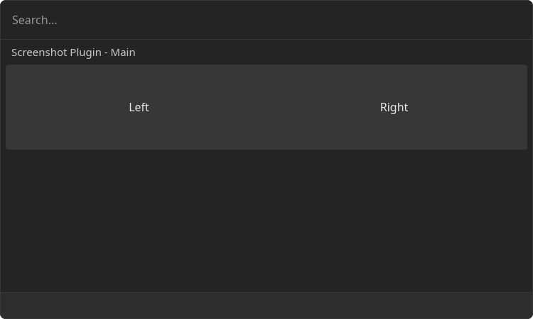
Example Two Columns
- src/main.tsx
- gauntlet.toml
import { ReactElement } from "react";
import { Inline } from "@project-gauntlet/api/components";

export default function Main({ text }: { text: string }): ReactElement {
    return (
        <Inline>
            <Inline.Left>
                <Inline.Left.Paragraph>
                    Left
                </Inline.Left.Paragraph>
            </Inline.Left>
            <Inline.Right>
                <Inline.Right.Paragraph>
                    Right
                </Inline.Right.Paragraph>
            </Inline.Right>
        </Inline>
    )
}
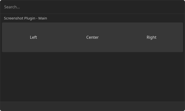
Example Three Columns
- src/main.tsx
- gauntlet.toml
import { ReactElement } from "react";
import { Inline } from "@project-gauntlet/api/components";

export default function Main({ text }: { text: string }): ReactElement | null {

    if (text != "example") {
        return null
    }

    return (
        <Inline>
            <Inline.Left>
                <Inline.Left.Paragraph>
                    Left
                </Inline.Left.Paragraph>
            </Inline.Left>
            <Inline.Center>
                <Inline.Center.Paragraph>
                    Center
                </Inline.Center.Paragraph>
            </Inline.Center>
            <Inline.Right>
                <Inline.Right.Paragraph>
                    Right
                </Inline.Right.Paragraph>
            </Inline.Right>
        </Inline>
    )
}
Children components (order-sensitive)
Available order-sensitive React children components. The order in which these elements are be placed in code will be reflected in UI
| Name | React Component Type | Amount |
|---|---|---|
| Paragraph | <Paragraph/> | Zero or More |
| Image | <Image/> | Zero or More |
| Svg | <Svg/> | Zero or More |
| H1 | <H1/> | Zero or More |
| H2 | <H2/> | Zero or More |
| H3 | <H3/> | Zero or More |
| H4 | <H4/> | Zero or More |
| H5 | <H5/> | Zero or More |
| H6 | <H6/> | Zero or More |
| HorizontalBreak | <HorizontalBreak/> | Zero or More |
| CodeBlock | <CodeBlock/> | Zero or More |
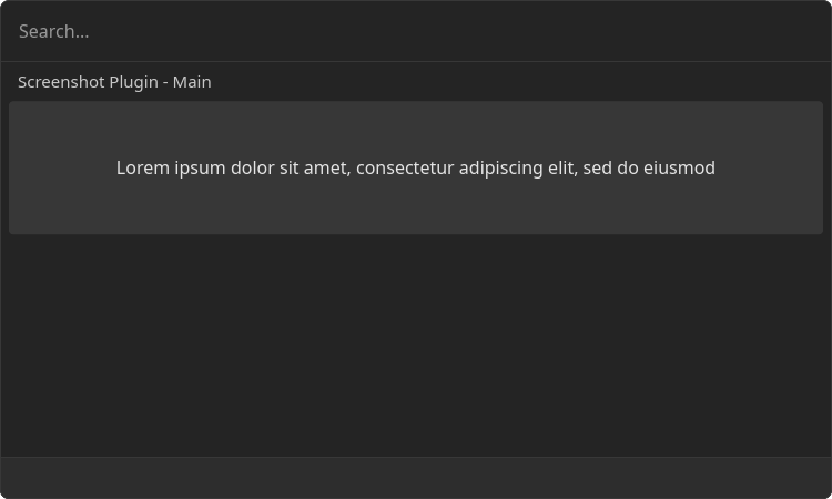
Inline.Center.Paragraph
Text paragraph
Example
- src/main.tsx
- gauntlet.toml
import { ReactElement } from "react";
import { Inline } from "@project-gauntlet/api/components";

export default function Main({ text }: { text: string }): ReactElement | null {

    if (text != "example") {
        return null
    }

    return (
        <Inline>
            <Inline.Center>
                <Inline.Center.Paragraph>
                    Lorem ipsum dolor sit amet, consectetur adipiscing elit, sed do eiusmod
                </Inline.Center.Paragraph>
            </Inline.Center>
        </Inline>
    )
}
Children components (order-sensitive)
Available order-sensitive React children components. The order in which these elements are be placed in code will be reflected in UI
| Name | React Component Type | Amount |
|---|---|---|
| string | Zero or More |
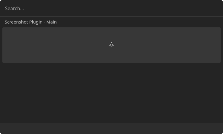
Inline.Center.Image
Component that displays arbitrary image
Example
- src/main.tsx
- gauntlet.toml
import { ReactElement } from "react";
import { Icons, Inline } from "@project-gauntlet/api/components";

export default function Main({ text }: { text: string }): ReactElement | null {

    if (text != "example") {
        return null
    }

    return (
        <Inline>
            <Inline.Center>
                <Inline.Center.Image source={Icons.Airplane}/>
            </Inline.Center>
        </Inline>
    )
}
Props
| Name | Is Required | Type | Description |
|---|---|---|---|
| source | Required | ImageLike | Image data. Supported formats: "png", "gif', "jpg", "webp", "tiff" |
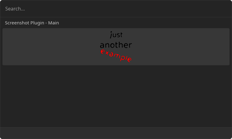
Inline.Center.Svg
Component that displays arbitrary SVG image
Example
- src/main.tsx
- gauntlet.toml
import { ReactElement } from "react";
import { Inline } from "@project-gauntlet/api/components";

const svgUrl = "https://upload.wikimedia.org/wikipedia/commons/8/84/Example.svg"

export default function Main({ text }: { text: string }): ReactElement | null {

    if (text != "example") {
        return null
    }

    return (
        <Inline>
            <Inline.Center>
                <Inline.Center.Svg source={{ url: svgUrl }}/>
            </Inline.Center>
        </Inline>
    )
}
Props
| Name | Is Required | Type | Description |
|---|---|---|---|
| source | Required | DataSource | SVG image |
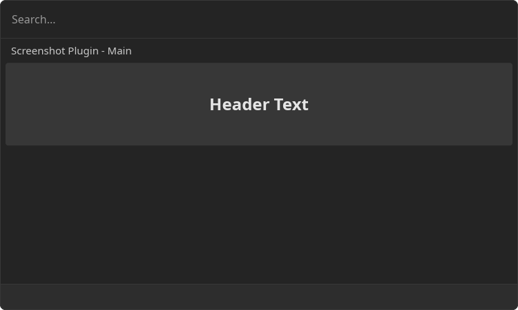
Inline.Center.H1-6
Headers
Example
- src/main.tsx
- gauntlet.toml
import { ReactElement } from "react";
import { Inline } from "@project-gauntlet/api/components";

export default function Main({ text }: { text: string }): ReactElement | null {

    if (text != "example") {
        return null
    }

    return (
        <Inline>
            <Inline.Center>
                <Inline.Center.H3>
                    Header Text
                </Inline.Center.H3>
            </Inline.Center>
        </Inline>
    )
}
Children components (order-sensitive)
Available order-sensitive React children components. The order in which these elements are be placed in code will be reflected in UI
| Name | React Component Type | Amount |
|---|---|---|
| string | Zero or More |
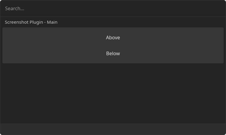
Inline.Center.HorizontalBreak
Horizontal line that divides the content
Example
- src/main.tsx
- gauntlet.toml
import { ReactElement } from "react";
import { Inline } from "@project-gauntlet/api/components";

export default function Main({ text }: { text: string }): ReactElement | null {

    if (text != "example") {
        return null
    }

    return (
        <Inline>
            <Inline.Center>
                <Inline.Center.Paragraph>
                    Above
                </Inline.Center.Paragraph>
                <Inline.Center.HorizontalBreak/>
                <Inline.Center.Paragraph>
                    Below
                </Inline.Center.Paragraph>
            </Inline.Center>
        </Inline>
    )
}
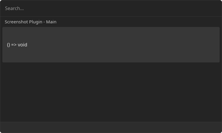
Inline.Center.CodeBlock
Block of text that is represented as a code
Example
- src/main.tsx
- gauntlet.toml
import { ReactElement } from "react";
import { Inline } from "@project-gauntlet/api/components";

export default function Main({ text }: { text: string }): ReactElement | null {

    if (text != "example") {
        return null
    }

    return (
        <Inline>
            <Inline.Center>
                <Inline.Center.CodeBlock>
                    {"() => void"}
                </Inline.Center.CodeBlock>
            </Inline.Center>
        </Inline>
    )
}
Children components (order-sensitive)
Available order-sensitive React children components. The order in which these elements are be placed in code will be reflected in UI
| Name | React Component Type | Amount |
|---|---|---|
| string | Zero or More |
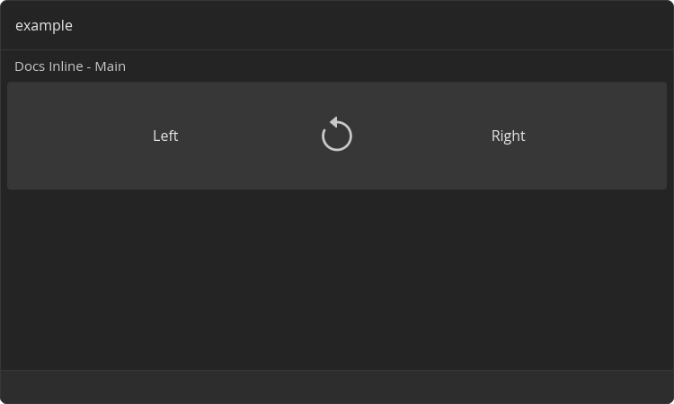
Inline.Separator
Inline is a root component used with "inline-view" entrypoint type. Displayed right under search bar in main view
Example
- src/main.tsx
- gauntlet.toml
import { ReactElement } from "react";
import { Inline, Icons } from "@project-gauntlet/api/components";

export default function Main({ text }: { text: string }): ReactElement | null {

    if (text != "example") {
        return null
    }

    return (
        <Inline>
            <Inline.Left>
                <Inline.Left.Paragraph>
                    Left
                </Inline.Left.Paragraph>
            </Inline.Left>
            <Inline.Separator icon={Icons.ArrowCounterClockwise}/>
            <Inline.Right>
                <Inline.Right.Paragraph>
                    Right
                </Inline.Right.Paragraph>
            </Inline.Right>
        </Inline>
    )
}