Grid
Overview
Grid is a view that is very similar to List view with the main difference that items are arranged into a grid allowing for items to be an image
Functionality
- Items can have title, subtitle and icon accessory
- Items can be grouped in sections with titles and subtitles
- Can optionally have a search bar
- If no items exist, text with image can be shown in the middle
- As with all other views can be made highly dynamic with help of React
Plugin Manifest
To use this view, entrypoint with type "view" is required
Example
[[entrypoint]]
id = 'main'
name = 'Main'
path = 'src/main.tsx'
type = 'view'
description = 'Description of a Grid view'
API Reference
Grid
Grid is a root component that allows to display a list of items represented in form of a grid.
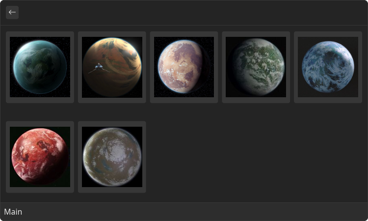
Example
- src/main.tsx
- gauntlet.toml
import { ReactElement } from "react";
import { Grid } from "@project-gauntlet/api/components";

const items = [
    {
        title: "Naboo",
        image: "https://static.wikia.nocookie.net/star-wars-canon/images/2/24/NabooFull-SW.png/revision/latest/scale-to-width-down/150?cb=20151218205422"
    },
    {
        title: "Ryloth",
        image: "https://static.wikia.nocookie.net/star-wars-canon/images/b/b7/Ryloth_Rebels.png/revision/latest/scale-to-width-down/150?cb=20161103040944"
    },
    {
        title: "Tatooine",
        image: "https://static.wikia.nocookie.net/star-wars-canon/images/b/b0/Tatooine_TPM.png/revision/latest/scale-to-width-down/150?cb=20151124205032"
    },
    {
        title: "Dagobah",
        image: "https://static.wikia.nocookie.net/star-wars-canon/images/4/48/Dagobah_ep3.jpg/revision/latest/scale-to-width-down/150?cb=20161103221846"
    },
    {
        title: "Endor",
        image: "https://static.wikia.nocookie.net/star-wars-canon/images/9/96/Endor-DB.png/revision/latest/scale-to-width-down/150?cb=20160711234205"
    },
    {
        title: "Dathomir",
        image: "https://static.wikia.nocookie.net/starwars/images/3/34/DathomirJFO.jpg/revision/latest/scale-to-width-down/150?cb=20200222032237"
    },
    {
        title: "Dantooine",
        image: "https://static.wikia.nocookie.net/starwars/images/9/9b/Dantooine-RebuildingTheResistance.jpg/revision/latest/scale-to-width-down/150?cb=20200120190043"
    },
]

export default function MainExample(): ReactElement {
    return (
        <Grid>
            {items.map(value => (
                <Grid.Item id={value.title} key={value.title} title={value.title}>
                    <Grid.Item.Content>
                        <Grid.Item.Content.Image source={{ url: value.image }}/>
                    </Grid.Item.Content>
                </Grid.Item>
            ))}
        </Grid>
    )
}
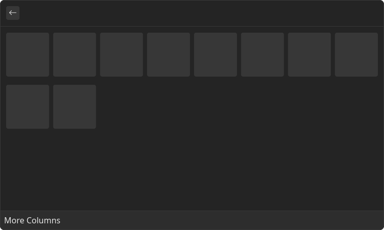
More Columns Example
- src/more-columns.tsx
- gauntlet.toml
import { ReactElement } from "react";
import { Grid } from "@project-gauntlet/api/components";

const items = [
    "🥹",
    "🤣",
    "🥵",
    "🤕",
    "🫥",
    "🤬",
    "🥱",
    "🤮",
    "🙄",
    "🤠"
]

export default function MoreColumnsExample(): ReactElement {
    return (
        <Grid columns={8}>
            {items.map(value => (
                <Grid.Item id={value} key={value}>
                    <Grid.Item.Content>
                        <Grid.Item.Content.Paragraph>{value}</Grid.Item.Content.Paragraph>
                    </Grid.Item.Content>
                </Grid.Item>
            ))}
        </Grid>
    )
}
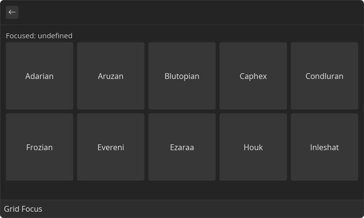
Focus Change Example
- src/focus.tsx
- gauntlet.toml
import { ReactElement, useState } from "react";
import { Grid } from "@project-gauntlet/api/components";

export default function FocusExample(): ReactElement {
    const [id, setId] = useState<string | undefined>(undefined);

    const content = (text: string) => (
        <Grid.Item.Content>
            <Grid.Item.Content.Paragraph>
                {text}
            </Grid.Item.Content.Paragraph>
        </Grid.Item.Content>
    );

    return (
        <Grid
            onItemFocusChange={setId}
        >
            <Grid.Section title={"Focused: " + id}>
                <Grid.Item id="adarian">{content("Adarian")}</Grid.Item>
                <Grid.Item id="aruzan">{content("Aruzan")}</Grid.Item>
                <Grid.Item id="blutopian">{content("Blutopian")}</Grid.Item>
                <Grid.Item id="caphex">{content("Caphex")}</Grid.Item>
                <Grid.Item id="condluran">{content("Condluran")}</Grid.Item>
                <Grid.Item id="frozian">{content("Frozian")}</Grid.Item>
                <Grid.Item id="evereni">{content("Evereni")}</Grid.Item>
                <Grid.Item id="ezaraa">{content("Ezaraa")}</Grid.Item>
                <Grid.Item id="houk">{content("Houk")}</Grid.Item>
                <Grid.Item id="inleshat">{content("Inleshat")}</Grid.Item>
            </Grid.Section>
        </Grid>
    )
}
Props
| Name | Is Required | Type | Description |
|---|---|---|---|
| isLoading | Optional | boolean | If "true" loading bar is shown above content |
| actions | Optional | <ActionPanel/> | Allows to define an Action Panel for this view. Every root component has such property |
| columns | Optional | number | Amount of columns that the grid will have |
| onItemFocusChange | Optional | () => void | Function that is called when focused item changes. Argument is an ID of new focused item |
Children components (order-sensitive)
Available order-sensitive React children components. The order in which these elements are be placed in code will be reflected in UI
| Name | React Component Type | Amount |
|---|---|---|
| Item | <GridItem/> | Zero or More |
| Section | <GridSection/> | Zero or More |
Children components (non-order-sensitive)
Available non-order-sensitive React children components. The position in children doesn't matter for these elements
| Name | React Component Type | Amount |
|---|---|---|
| SearchBar | <SearchBar/> | Zero or One |
| EmptyView | <EmptyView/> | Zero or One |
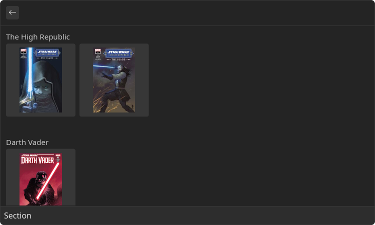
Grid.Section
Grid section allows to group a list of the Grid Items under some name
Example
- src/section.tsx
- gauntlet.toml
import { ReactElement } from "react";
import { Grid } from "@project-gauntlet/api/components";

const theBlade1 = "https://static.wikia.nocookie.net/starwars/images/a/a4/The-Blade-1-final-cover.jpg/revision/latest/scale-to-width-down/150?cb=20221215195606"
const theBlade2 = "https://static.wikia.nocookie.net/starwars/images/f/fd/The-Blade-2-Final-Cover.jpg/revision/latest/scale-to-width-down/150?cb=20230120033002"

const vader1 = "https://static.wikia.nocookie.net/starwars/images/9/9a/Darth_VaderDark_Lord_of_the_Sith.jpg/revision/latest/scale-to-width-down/150?cb=20190223230434"

export default function SectionExample(): ReactElement {
    return (
        <Grid>
            <Grid.Section title="The High Republic">
                <Grid.Item id="the-blade-1" title="The Blade 1">
                    <Grid.Item.Content>
                        <Grid.Item.Content.Image source={{ url: theBlade1 }}/>
                    </Grid.Item.Content>
                </Grid.Item>
                <Grid.Item id="the-blade-2" title="The Blade 2">
                    <Grid.Item.Content>
                        <Grid.Item.Content.Image source={{ url: theBlade2 }}/>
                    </Grid.Item.Content>
                </Grid.Item>
            </Grid.Section>
            <Grid.Section title="Darth Vader">
                <Grid.Item id="darth-vader-1" title="Darth Vader 1">
                    <Grid.Item.Content>
                        <Grid.Item.Content.Image source={{ url: vader1 }}/>
                    </Grid.Item.Content>
                </Grid.Item>
            </Grid.Section>
        </Grid>
    )
}
Props
| Name | Is Required | Type | Description |
|---|---|---|---|
| title | Required | string | Title of the section |
| subtitle | Optional | string | Smaller text displayed next to the title |
| columns | Optional | number | Amount of columns that the grid in this section will have |
Children components (order-sensitive)
Available order-sensitive React children components. The order in which these elements are be placed in code will be reflected in UI
| Name | React Component Type | Amount |
|---|---|---|
| Item | <GridItem/> | Zero or More |
Grid.SearchBar
Adds search bar above the content. Text in search bar can be read and set
Example
- src/search-bar.tsx
- gauntlet.toml
import { ReactElement, useState } from "react";
import { Grid } from "@project-gauntlet/api/components";

const results = [
    "Disturbances in the Force",
    "Bounty hunters",
    "Astromech droids",
    "Celestials and their technology",
    "What happened on holidays?",
    "Ahsoka Tano",
    "Mandalorian Culture"
]

export default function SearchBarExample(): ReactElement {
    const [searchText, setSearchText] = useState<string | undefined>("");

    return (
        <Grid>
            <Grid.SearchBar placeholder="What knowledge do you seek...?"
                            value={searchText}
                            onChange={setSearchText}
            />
            {results
                .filter(value => !searchText ? true : value.toLowerCase().includes(searchText))
                .map(value => (
                    <Grid.Item id={value}>
                        <Grid.Item.Content>
                            <Grid.Item.Content.Paragraph>
                                {value}
                            </Grid.Item.Content.Paragraph>
                        </Grid.Item.Content>
                    </Grid.Item>
                ))
            }
        </Grid>
    )
}
Programmatic Search Bar Update Example
- src/search-bar-set-search-text.tsx
- gauntlet.toml
import { ReactElement, useState } from "react";
import { Action, ActionPanel, Grid } from "@project-gauntlet/api/components";

export default function SearchBarSetSearchTextExample(): ReactElement {
    const [searchText, setSearchText] = useState<string | undefined>("");

    return (
        <Grid
            actions={
                <ActionPanel>
                    <Action label="Set value" onAction={(id) => setSearchText(id)}/>
                </ActionPanel>
            }
        >
            <Grid.SearchBar value={searchText} onChange={setSearchText}/>
            <Grid.Item id="This will be the value in search bar">
                <Grid.Item.Content>
                    <Grid.Item.Content.Paragraph>
                        Click me!
                    </Grid.Item.Content.Paragraph>
                </Grid.Item.Content>
            </Grid.Item>
        </Grid>
    )
}
Props
| Name | Is Required | Type | Description |
|---|---|---|---|
| value | Optional | string | |
| placeholder | Optional | string | |
| onChange | Optional | () => void |
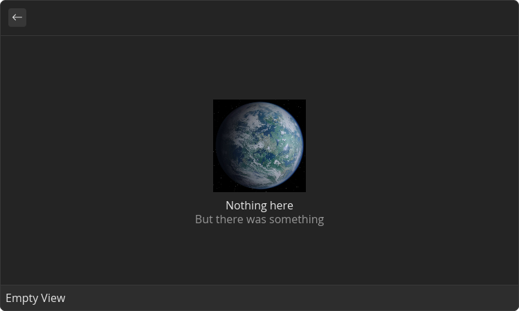
Grid.EmptyView
View that will be displayed if there is no grid or list items available.
Example
- src/empty-view.tsx
- gauntlet.toml
import { ReactElement } from "react";
import { Grid } from "@project-gauntlet/api/components";

const alderaanImage = "https://static.wikia.nocookie.net/starwars/images/4/4a/Alderaan.jpg/revision/latest?cb=20061211013805"

export default function EmptyViewExample(): ReactElement {
    return (
        <Grid>
            <Grid.EmptyView title="Nothing here" description="But there was something" image={{ url: alderaanImage }}/>
        </Grid>
    )
}
Props
| Name | Is Required | Type | Description |
|---|---|---|---|
| title | Required | string | Main text to display in the middle of the view. |
| description | Optional | string | Optional description to display in the middle of the view under `title`. Use it to give longer explanation for empty view |
| image | Optional | ImageLike | Image to display in the middle of the view |
Grid.Item
Item on the grid
Props
| Name | Is Required | Type | Description |
|---|---|---|---|
| id | Required | string | ID of the list item. Used in List's onItemFocusChange event |
| title | Optional | string | Title displayed under the grid item |
| subtitle | Optional | string | Smaller text displayed next to the title |
| accessory | Optional | <IconAccessory/> | Accessory displayed on the right bottom of the grid item |
Grid.Item.Content
Content is a container for a set of non-interactable components. Used in a variety of places like <Detail/>, <Inline/> and <GridItem/>. By utilizing the power of React the content can also be made dynamic
Children components (order-sensitive)
Available order-sensitive React children components. The order in which these elements are be placed in code will be reflected in UI
| Name | React Component Type | Amount |
|---|---|---|
| Paragraph | <Paragraph/> | Zero or More |
| Image | <Image/> | Zero or More |
| Svg | <Svg/> | Zero or More |
| H1 | <H1/> | Zero or More |
| H2 | <H2/> | Zero or More |
| H3 | <H3/> | Zero or More |
| H4 | <H4/> | Zero or More |
| H5 | <H5/> | Zero or More |
| H6 | <H6/> | Zero or More |
| HorizontalBreak | <HorizontalBreak/> | Zero or More |
| CodeBlock | <CodeBlock/> | Zero or More |
Grid.Item.Content.Paragraph
Text paragraph
Example
- src/content-paragraph.tsx
- gauntlet.toml
import { ReactElement } from "react";
import { Grid } from "@project-gauntlet/api/components";

const items = [
    "C-3PO",
    "R2-D2",
    "BB-8",
    "IG-88",
    "D-O",
    "C1-10P",
]

export default function ContentParagraphExample(): ReactElement {
    return (
        <Grid>
            {items.map(value => (
                <Grid.Item id={value} key={value}>
                    <Grid.Item.Content>
                        <Grid.Item.Content.Paragraph>
                            {value}
                        </Grid.Item.Content.Paragraph>
                    </Grid.Item.Content>
                </Grid.Item>
            ))}
        </Grid>
    )
}
Children components (order-sensitive)
Available order-sensitive React children components. The order in which these elements are be placed in code will be reflected in UI
| Name | React Component Type | Amount |
|---|---|---|
| string | Zero or More |
Grid.Item.Content.Image
Component that displays arbitrary image
Example
- src/content-image.tsx
- gauntlet.toml
import { ReactElement } from "react";
import { Grid } from "@project-gauntlet/api/components";

const url = "https://static.wikia.nocookie.net/star-wars-canon/images/b/b0/Tatooine_TPM.png/revision/latest/scale-to-width-down/150?cb=20151124205032";

export default function ContentImageExample(): ReactElement {
    return (
        <Grid>
            <Grid.Item id="tatooine" title="Tatooine">
                <Grid.Item.Content>
                    <Grid.Item.Content.Image source={{ url: url }}/>
                </Grid.Item.Content>
            </Grid.Item>
        </Grid>
    )
}
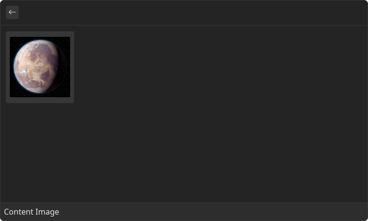
Props
| Name | Is Required | Type | Description |
|---|---|---|---|
| source | Required | ImageLike | Image data. Supported formats: "png", "gif', "jpg", "webp", "tiff" |
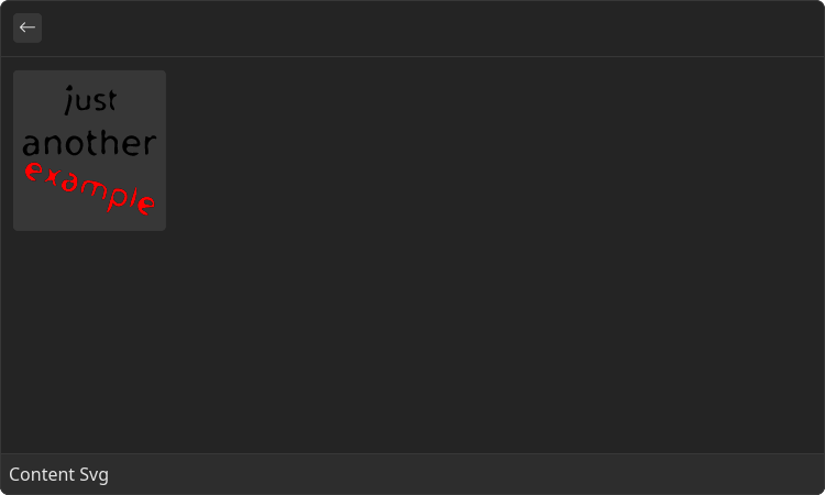
Grid.Item.Content.Svg
Component that displays arbitrary SVG image
Example
- src/content-svg.tsx
- gauntlet.toml
import { ReactElement } from "react";
import { Grid } from "@project-gauntlet/api/components";

const svgUrl = "https://upload.wikimedia.org/wikipedia/commons/8/84/Example.svg"

export default function ContentSvgExample(): ReactElement {
    return (
        <Grid>
            <Grid.Item id="svg">
                <Grid.Item.Content>
                    <Grid.Item.Content.Svg source={{ url: svgUrl }}/>
                </Grid.Item.Content>
            </Grid.Item>
        </Grid>
    )
}
Props
| Name | Is Required | Type | Description |
|---|---|---|---|
| source | Required | DataSource | SVG image |
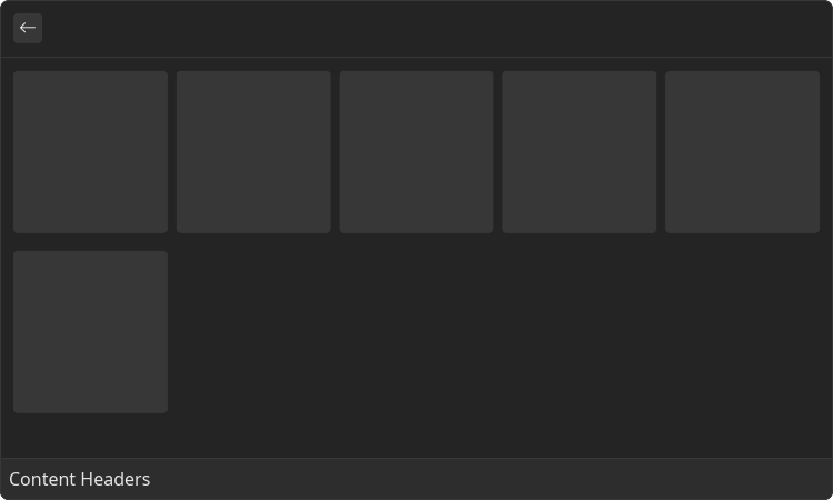
Grid.Item.Content.H1-6
Headers
Example
- src/content-headers.tsx
- gauntlet.toml
import { ReactElement } from "react";
import { Grid } from "@project-gauntlet/api/components";

export default function ContentHeadersExample(): ReactElement {
    return (
        <Grid>
            <Grid.Item id="episode-1">
                <Grid.Item.Content>
                    <Grid.Item.Content.H1>
                        Episode I
                    </Grid.Item.Content.H1>
                </Grid.Item.Content>
            </Grid.Item>
            <Grid.Item id="episode-2">
                <Grid.Item.Content>
                    <Grid.Item.Content.H2>
                        Episode II
                    </Grid.Item.Content.H2>
                </Grid.Item.Content>
            </Grid.Item>
            <Grid.Item id="episode-3">
                <Grid.Item.Content>
                    <Grid.Item.Content.H3>
                        Episode III
                    </Grid.Item.Content.H3>
                </Grid.Item.Content>
            </Grid.Item>
            <Grid.Item id="episode-4">
                <Grid.Item.Content>
                    <Grid.Item.Content.H4>
                        Episode IV
                    </Grid.Item.Content.H4>
                </Grid.Item.Content>
            </Grid.Item>
            <Grid.Item id="episode-5">
                <Grid.Item.Content>
                    <Grid.Item.Content.H4>
                        Episode V
                    </Grid.Item.Content.H4>
                </Grid.Item.Content>
            </Grid.Item>
            <Grid.Item id="episode-6">
                <Grid.Item.Content>
                    <Grid.Item.Content.H4>
                        Episode VI
                    </Grid.Item.Content.H4>
                </Grid.Item.Content>
            </Grid.Item>
        </Grid>
    )
}
Children components (order-sensitive)
Available order-sensitive React children components. The order in which these elements are be placed in code will be reflected in UI
| Name | React Component Type | Amount |
|---|---|---|
| string | Zero or More |
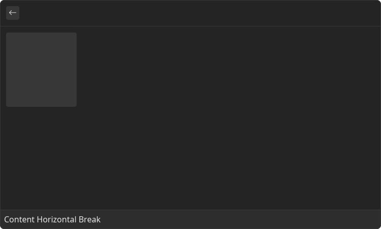
Grid.Item.Content.HorizontalBreak
Horizontal line that divides the content
Example
- src/content-horizontal-break.tsx
- gauntlet.toml
import { ReactElement } from "react";
import { Grid } from "@project-gauntlet/api/components";

export default function ContentHorizontalBreak(): ReactElement {
    return (
        <Grid>
            <Grid.Item id="test">
                <Grid.Item.Content>
                    <Grid.Item.Content.Paragraph>
                        C-3PO
                    </Grid.Item.Content.Paragraph>
                    <Grid.Item.Content.HorizontalBreak/>
                    <Grid.Item.Content.Paragraph>
                        BB-8
                    </Grid.Item.Content.Paragraph>
                </Grid.Item.Content>
            </Grid.Item>
        </Grid>
    )
}
Grid.Item.Content.CodeBlock
Block of text that is represented as a code
Example
- src/content-code-block.tsx
- gauntlet.toml
import { ReactElement } from "react";
import { Grid } from "@project-gauntlet/api/components";

const items = [
    "C-3PO",
    "R2-D2",
    "BB-8",
    "IG-88",
    "D-O",
    "C1-10P",
]

export default function ContentCodeBlockExample(): ReactElement {
    return (
        <Grid>
            {items.map(value => (
                <Grid.Item id={value} key={value}>
                    <Grid.Item.Content>
                        <Grid.Item.Content.CodeBlock>
                            {value}
                        </Grid.Item.Content.CodeBlock>
                    </Grid.Item.Content>
                </Grid.Item>
            ))}
        </Grid>
    )
}

Children components (order-sensitive)
Available order-sensitive React children components. The order in which these elements are be placed in code will be reflected in UI
| Name | React Component Type | Amount |
|---|---|---|
| string | Zero or More |