List
Overview
List is a view that displays a list (duh...) of items with some bells and whistles
Functionality
- Items can have icons on left, title, subtitle and icons with optional text on right
- Items can be grouped in sections with titles and subtitles
- Can optionally have a search bar
- Can have a Detail side view
- If no items exist, text with image can be shown in the middle
- As with all other views can be made highly dynamic with help of React
Plugin Manifest
To use this view, entrypoint with type "view" is required
Example
[[entrypoint]]
id = 'main'
name = 'Main'
path = 'src/main.tsx'
type = 'view'
description = 'Description of a List view'
API Reference
List
List is a root component that allows to display a list of items.
Example
- src/main.tsx
- gauntlet.toml
import { ReactElement } from "react";
import { Action, ActionPanel, IconAccessory, Icons, List, TextAccessory } from "@project-gauntlet/api/components";
export default function MainExample(): ReactElement {
return (
<List
actions={
<ActionPanel>
<Action label="Select" onAction={() => {}}/>
</ActionPanel>
}
>
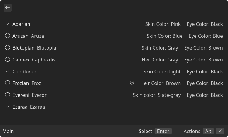
<List.Item
id="adarian"
title="Adarian"
icon={Icons.Checkmark}
accessories={[
<TextAccessory text="Skin Color: Pink"/>,
<TextAccessory text="Eye Color: Black"/>,
]}
/>
<List.Item
id="aruzan"
title="Aruzan"
subtitle="Aruza"
icon={Icons.Circle}
accessories={[
<TextAccessory text="Skin Color: Blue"/>,
<TextAccessory text="Eye Color: Blue"/>,
]}
/>
<List.Item
id="blutopian"
title="Blutopian"
subtitle="Blutopia"
icon={Icons.Circle}
accessories={[
<TextAccessory text="Skin Color: Gray"/>,
<TextAccessory text="Eye Color: Brown"/>,
]}
/>
<List.Item
id="caphex"
title="Caphex"
subtitle="Caphexdis"
icon={Icons.Circle}
accessories={[
<TextAccessory text="Heir Color: Gray"/>,
<TextAccessory text="Eye Color: Brown"/>,
]}
/>
<List.Item
id="condluran"
title="Condluran"
icon={Icons.Checkmark}
accessories={[
<TextAccessory text="Skin Color: Light"/>,
<TextAccessory text="Eye Color: Black"/>,
]}
/>
<List.Item
id="frozian"
title="Frozian"
subtitle="Froz"
icon={Icons.Circle}
accessories={[
<IconAccessory icon={Icons.Snowflake}/>,
<TextAccessory text="Heir Color: Brown"/>,
<TextAccessory text="Eye Color: Black"/>,
]}
/>
<List.Item
id="evereni"
title="Evereni"
subtitle="Everon"
icon={Icons.Circle}
accessories={[
<TextAccessory text="Skin color: Slate-gray"/>,
<TextAccessory text="Eye Color: Black"/>,
]}
/>
<List.Item
id="ezaraa"
title="Ezaraa"
subtitle="Ezaraa"
icon={Icons.Checkmark}
/>
</List>
)
}
Props
| Name | Is Required | Type | Description |
|---|---|---|---|
| actions | Optional | <ActionPanel/> | Allows to define an Action Panel for this view. Every root component has such property |
| isLoading | Optional | boolean | If "true" loading bar is shown above content |
| onItemFocusChange | Optional | () => void | Function that is called when focused item changes. Argument is an ID of new focused item |
Children components (order-sensitive)
Available order-sensitive React children components. The order in which these elements are be placed in code will be reflected in UI
| Name | React Component Type | Amount |
|---|---|---|
| Item | <ListItem/> | Zero or More |
| Section | <ListSection/> | Zero or More |
Children components (non-order-sensitive)
Available non-order-sensitive React children components. The position in children doesn't matter for these elements
| Name | React Component Type | Amount |
|---|---|---|
| SearchBar | <SearchBar/> | Zero or One |
| EmptyView | <EmptyView/> | Zero or One |
| Detail | <Detail/> | Zero or One |
List.Item
Item on the list
Example
- src/item.tsx
- gauntlet.toml
import { ReactElement } from "react";
import { IconAccessory, Icons, List, TextAccessory } from "@project-gauntlet/api/components";
export default function ItemExample(): ReactElement {
return (
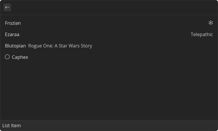
<List>
<List.Item id="frozian" title="Frozian" accessories={[<IconAccessory icon={Icons.Snowflake}/>]}/>
<List.Item id="ezaraa" title="Ezaraa" accessories={[<TextAccessory text="Telepathic"/>]}/>
<List.Item id="blutopian" title="Blutopian" subtitle="Rogue One: A Star Wars Story"/>
<List.Item id="caphex" title="Caphex" icon={Icons.Circle}/>
</List>
)
}
Focus Change Example
- src/focus.tsx
- gauntlet.toml
import { ReactElement, useState } from "react";
import { List } from "@project-gauntlet/api/components";

export default function FocusExample(): ReactElement {
    const [id, setId] = useState<string | undefined>(undefined);

    return (
        <List onItemFocusChange={setId}>
            <List.Item id="adarian" title="Adarian"/>
            <List.Item id="aruzan" title="Aruzan"/>
            <List.Item id="blutopian" title="Blutopian"/>
            <List.Item id="caphex" title="Caphex"/>
            <List.Item id="condluran" title="Condluran"/>
            <List.Item id="frozian" title="Frozian"/>
            <List.Item id="evereni" title="Evereni"/>
            <List.Item id="ezaraa" title="Ezaraa"/>
            <List.Item id="houk" title="Houk"/>
            <List.Item id="inleshat" title="Inleshat"/>
            <List.Detail>
                <List.Detail.Content>
                    <List.Detail.Content.Paragraph>
                        Focused: {id}
                    </List.Detail.Content.Paragraph>
                </List.Detail.Content>
            </List.Detail>
        </List>
    )
}

Props
| Name | Is Required | Type | Description |
|---|---|---|---|
| id | Required | string | ID of the list item. Used in List's onItemFocusChange event |
| title | Required | string | Title of the list item |
| subtitle | Optional | string | Smaller text displayed next to the title |
| icon | Optional | ImageLike | Icon or custom image displayed on the left side of the list item |
| accessories | Optional | <TextAccessory/> | <IconAccessory/>[] | List of accessories displayed on the right-hand side of the list item |
List.Section
List section allows to group a list of the List Items under some name
Example
- src/section.tsx
- gauntlet.toml
import { ReactElement } from "react";
import { List } from "@project-gauntlet/api/components";
export default function SectionExample(): ReactElement {
return (
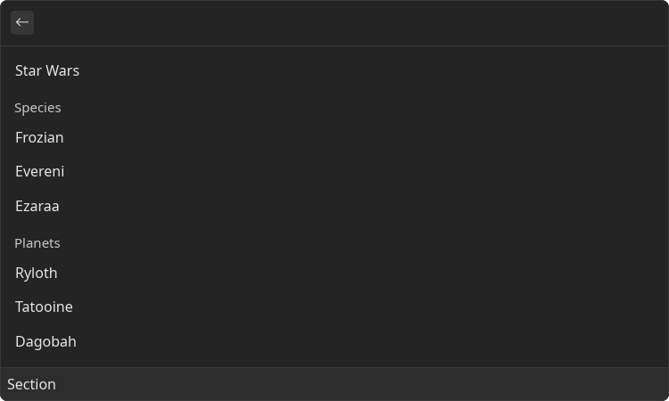
<List>
<List.Item id="star-wars" title="Star Wars"/>
<List.Section title="Species">
<List.Item id="frozian" title="Frozian"/>
<List.Item id="evereni" title="Evereni"/>
<List.Item id="ezaraa" title="Ezaraa"/>
</List.Section>
<List.Section title="Planets">
<List.Item id="ryloth" title="Ryloth"/>
<List.Item id="tatooine" title="Tatooine"/>
<List.Item id="dagobah" title="Dagobah"/>
<List.Item id="coruscant" title="Coruscant"/>
</List.Section>
</List>
)
}
Props
| Name | Is Required | Type | Description |
|---|---|---|---|
| title | Required | string | Title of the section |
| subtitle | Optional | string | Smaller text displayed next to the title |
Children components (order-sensitive)
Available order-sensitive React children components. The order in which these elements are be placed in code will be reflected in UI
| Name | React Component Type | Amount |
|---|---|---|
| Item | <ListItem/> | Zero or More |
List.SearchBar
Adds search bar above the content. Text in search bar can be read and set
Example
- src/search-bar.tsx
- gauntlet.toml
import { ReactElement, useState } from "react";
import { List } from "@project-gauntlet/api/components";
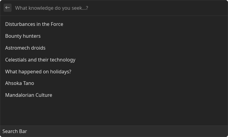
const results = [
"Disturbances in the Force",
"Bounty hunters",
"Astromech droids",
"Celestials and their technology",
"What happened on holidays?",
"Ahsoka Tano",
"Mandalorian Culture"
]
export default function SearchBarExample(): ReactElement {
const [searchText, setSearchText] = useState<string | undefined>("");
return (
<List>
<List.SearchBar placeholder="What knowledge do you seek...?"
value={searchText}
onChange={setSearchText}
/>
{results
.filter(value => !searchText ? true : value.toLowerCase().includes(searchText))
.map(value => (
<List.Item id={value} title={value}/>
))
}
</List>
)
}
Programmatic Search Bar Update Example
- src/search-bar-set-search-text.tsx
- gauntlet.toml
import { ReactElement, useState } from "react";
import { Action, ActionPanel, List } from "@project-gauntlet/api/components";

export default function SearchBarSetSearchTextExample(): ReactElement {
    const [searchText, setSearchText] = useState<string | undefined>("");

    return (
        <List
            actions={
                <ActionPanel>
                    <Action label="Set value" onAction={(id) => setSearchText(id)}/>
                </ActionPanel>
            }
        >
            <List.SearchBar value={searchText} onChange={setSearchText}/>
            <List.Item id="This will be the value in search bar" title="Click me!"/>
        </List>
    )
}
Props
| Name | Is Required | Type | Description |
|---|---|---|---|
| value | Optional | string | |
| placeholder | Optional | string | |
| onChange | Optional | () => void |
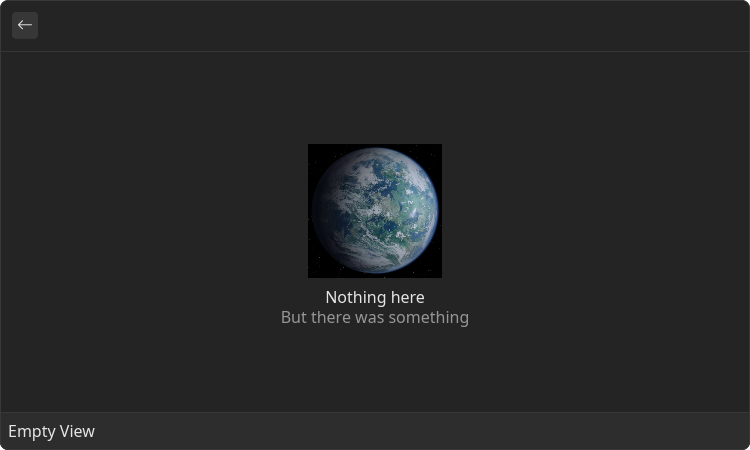
List.EmptyView
View that will be displayed if there is no grid or list items available.
Example
- src/empty-view.tsx
- gauntlet.toml
import { ReactElement } from "react";
import { List } from "@project-gauntlet/api/components";

const alderaanImage = "https://static.wikia.nocookie.net/starwars/images/4/4a/Alderaan.jpg/revision/latest?cb=20061211013805"

export default function EmptyViewExample(): ReactElement {
    return (
        <List>
            <List.EmptyView title="Nothing here" description="But there was something" image={{ url: alderaanImage }}/>
        </List>
    )
}
Props
| Name | Is Required | Type | Description |
|---|---|---|---|
| title | Required | string | Main text to display in the middle of the view. |
| description | Optional | string | Optional description to display in the middle of the view under `title`. Use it to give longer explanation for empty view |
| image | Optional | ImageLike | Image to display in the middle of the view |
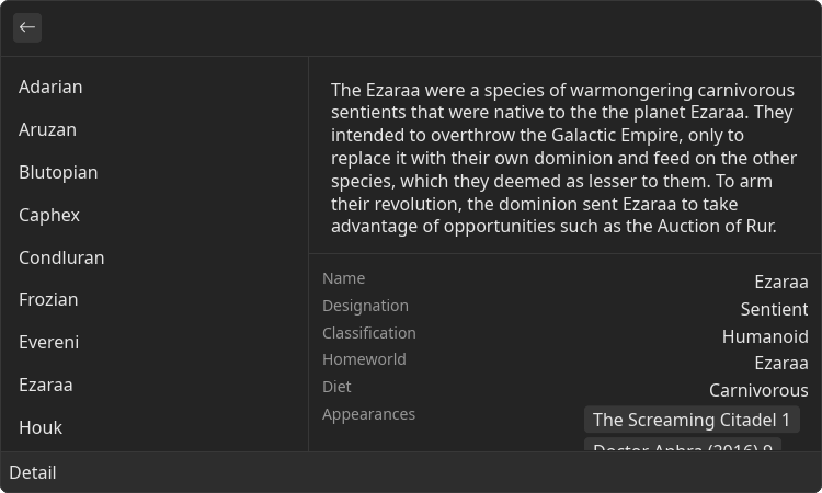
List.Detail
Detail is a root component that contains a possibly dynamic, non-interactable <Content/> component and an optional side panel
Example
- src/detail.tsx
- gauntlet.toml
import { ReactElement } from "react";
import { List } from "@project-gauntlet/api/components";
export default function DetailExample(): ReactElement {
return (
<List>
<List.Item id="adarian" title="Adarian"/>
<List.Item id="aruzan" title="Aruzan"/>
<List.Item id="blutopian" title="Blutopian"/>
<List.Item id="caphex" title="Caphex"/>
<List.Item id="condluran" title="Condluran"/>
<List.Item id="frozian" title="Frozian"/>
<List.Item id="evereni" title="Evereni"/>
<List.Item id="ezaraa" title="Ezaraa"/>
<List.Item id="houk" title="Houk"/>
<List.Item id="inleshat" title="Inleshat"/>
<List.Detail>
<List.Detail.Metadata>
<List.Detail.Metadata.Value label={"Name"}>Ezaraa</List.Detail.Metadata.Value>
<List.Detail.Metadata.Value label={"Designation"}>Sentient</List.Detail.Metadata.Value>
<List.Detail.Metadata.Value label={"Classification"}>Humanoid</List.Detail.Metadata.Value>
<List.Detail.Metadata.Value label={"Homeworld"}>Ezaraa</List.Detail.Metadata.Value>
<List.Detail.Metadata.Value label={"Diet"}>Carnivorous</List.Detail.Metadata.Value>
<List.Detail.Metadata.TagList label={"Appearances"}>
<List.Detail.Metadata.TagList.Item>The Screaming Citadel 1</List.Detail.Metadata.TagList.Item>
<List.Detail.Metadata.TagList.Item>Doctor Aphra (2016) 9</List.Detail.Metadata.TagList.Item>
<List.Detail.Metadata.TagList.Item>Doctor Aphra (2016) 10</List.Detail.Metadata.TagList.Item>
<List.Detail.Metadata.TagList.Item>Doctor Aphra (2016) 11</List.Detail.Metadata.TagList.Item>
<List.Detail.Metadata.TagList.Item>Doctor Aphra (2016) 12</List.Detail.Metadata.TagList.Item>
</List.Detail.Metadata.TagList>
</List.Detail.Metadata>
<List.Detail.Content>
<List.Detail.Content.Paragraph>
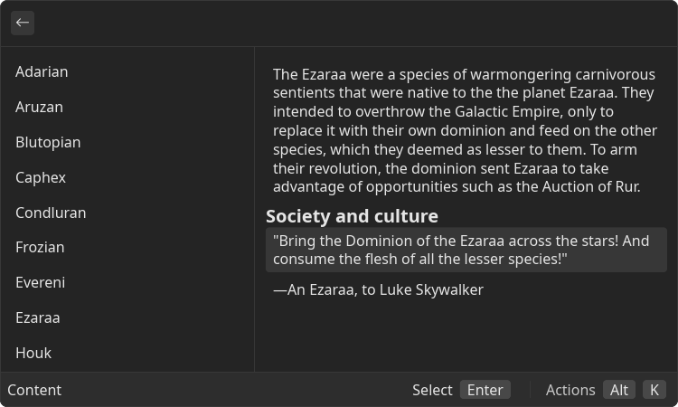
The Ezaraa were a species of warmongering carnivorous sentients that were native to the the planet
Ezaraa.
They intended to overthrow the Galactic Empire, only to replace it with their own dominion and feed
on the other species, which they deemed as lesser to them.
To arm their revolution, the dominion sent Ezaraa to take advantage of opportunities such as the
Auction of Rur.
</List.Detail.Content.Paragraph>
<List.Detail.Content.H4>
Society and culture
</List.Detail.Content.H4>
<List.Detail.Content.CodeBlock>
"Bring the Dominion of the Ezaraa across the stars! And consume the flesh of all the lesser
species!"
</List.Detail.Content.CodeBlock>
<List.Detail.Content.Paragraph>
―An Ezaraa, to Luke Skywalker
</List.Detail.Content.Paragraph>
</List.Detail.Content>
</List.Detail>
</List>
)
}
Props
| Name | Is Required | Type | Description |
|---|---|---|---|
| isLoading | Optional | boolean | If "true" loading bar is shown above content |
| actions | Optional | <ActionPanel/> | Allows to define an Action Panel for this view. Every root component has such property |
Children components (non-order-sensitive)
Available non-order-sensitive React children components. The position in children doesn't matter for these elements
| Name | React Component Type | Amount |
|---|---|---|
| Metadata | <Metadata/> | Zero or One |
| Content | <Content/> | Zero or One |
List.Detail.Metadata
Metadata is a component that displays list of name-value pairs. Can contain interactive parts
Example
- src/metadata.tsx
- gauntlet.toml
import { ReactElement } from "react";
import { Action, ActionPanel, List } from "@project-gauntlet/api/components";

export default function MetadataExample(): ReactElement {
    return (
        <List
            actions={
                <ActionPanel>
                    <Action label="Select" onAction={() => {}}/>
                </ActionPanel>
            }
        >
            <List.Item id="adarian" title="Adarian"/>
            <List.Item id="aruzan" title="Aruzan"/>
            <List.Item id="blutopian" title="Blutopian"/>
            <List.Item id="caphex" title="Caphex"/>
            <List.Item id="condluran" title="Condluran"/>
            <List.Item id="frozian" title="Frozian"/>
            <List.Item id="evereni" title="Evereni"/>
            <List.Item id="ezaraa" title="Ezaraa"/>
            <List.Item id="houk" title="Houk"/>
            <List.Item id="inleshat" title="Inleshat"/>
            <List.Detail>
                <List.Detail.Metadata>
                    <List.Detail.Metadata.Value label={"Name"}>Ezaraa</List.Detail.Metadata.Value>
                    <List.Detail.Metadata.Value label={"Designation"}>Sentient</List.Detail.Metadata.Value>
                    <List.Detail.Metadata.Value label={"Classification"}>Humanoid</List.Detail.Metadata.Value>
                    <List.Detail.Metadata.Value label={"Homeworld"}>Ezaraa</List.Detail.Metadata.Value>
                    <List.Detail.Metadata.Value label={"Diet"}>Carnivorous</List.Detail.Metadata.Value>
                    <List.Detail.Metadata.TagList label={"Appearances"}>
                        <List.Detail.Metadata.TagList.Item>The Screaming Citadel 1</List.Detail.Metadata.TagList.Item>
                        <List.Detail.Metadata.TagList.Item>Doctor Aphra (2016) 9</List.Detail.Metadata.TagList.Item>
                        <List.Detail.Metadata.TagList.Item>Doctor Aphra (2016) 10</List.Detail.Metadata.TagList.Item>
                        <List.Detail.Metadata.TagList.Item>Doctor Aphra (2016) 11</List.Detail.Metadata.TagList.Item>
                        <List.Detail.Metadata.TagList.Item>Doctor Aphra (2016) 12</List.Detail.Metadata.TagList.Item>
                    </List.Detail.Metadata.TagList>
                </List.Detail.Metadata>
            </List.Detail>
        </List>
    )
}
Children components (order-sensitive)
Available order-sensitive React children components. The order in which these elements are be placed in code will be reflected in UI
| Name | React Component Type | Amount |
|---|---|---|
| TagList | <MetadataTagList/> | Zero or More |
| Link | <MetadataLink/> | Zero or More |
| Value | <MetadataValue/> | Zero or More |
| Icon | <MetadataIcon/> | Zero or More |
| Separator | <MetadataSeparator/> | Zero or More |
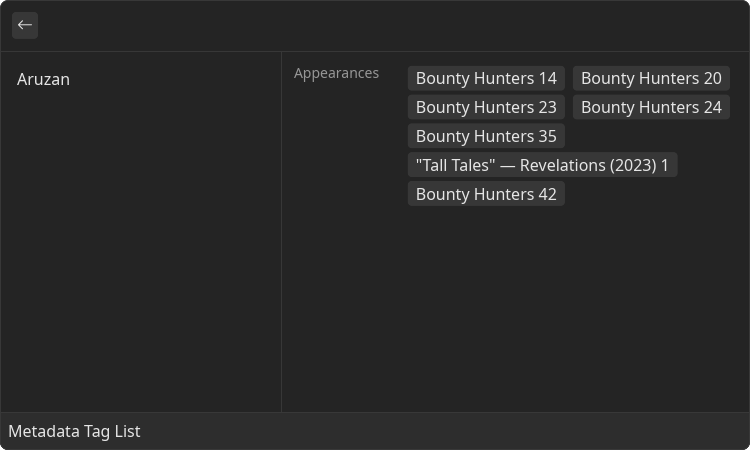
List.Detail.Metadata.TagList
List of tags with a title Tags can be used as clickable button
Example
- src/metadata-tag-list.tsx
- gauntlet.toml
import { ReactElement } from "react";
import { List } from "@project-gauntlet/api/components";

export default function MetadataTagListExample(): ReactElement {
    return (
        <List>
            <List.Item id="aruzan" title="Aruzan"/>
            <List.Detail>
                <List.Detail.Metadata>
                    <List.Detail.Metadata.TagList label="Appearances">
                        <List.Detail.Metadata.TagList.Item>Bounty Hunters 14</List.Detail.Metadata.TagList.Item>
                        <List.Detail.Metadata.TagList.Item>Bounty Hunters 20</List.Detail.Metadata.TagList.Item>
                        <List.Detail.Metadata.TagList.Item>Bounty Hunters 23</List.Detail.Metadata.TagList.Item>
                        <List.Detail.Metadata.TagList.Item>Bounty Hunters 24</List.Detail.Metadata.TagList.Item>
                        <List.Detail.Metadata.TagList.Item>Bounty Hunters 35</List.Detail.Metadata.TagList.Item>
                        <List.Detail.Metadata.TagList.Item>"Tall Tales" — Revelations (2023) 1</List.Detail.Metadata.TagList.Item>
                        <List.Detail.Metadata.TagList.Item>Bounty Hunters 42</List.Detail.Metadata.TagList.Item>
                    </List.Detail.Metadata.TagList>
                </List.Detail.Metadata>
            </List.Detail>
        </List>
    )
}
Props
| Name | Is Required | Type | Description |
|---|---|---|---|
| label | Required | string | Name of the value |
Children components (order-sensitive)
Available order-sensitive React children components. The order in which these elements are be placed in code will be reflected in UI
| Name | React Component Type | Amount |
|---|---|---|
| Item | <MetadataTagItem/> | Zero or More |
List.Detail.Metadata.TagList.Item
Tag item
Props
| Name | Is Required | Type | Description |
|---|---|---|---|
| onClick | Optional | () => void | Function that will be executed when user clicks on the tag |
Children components (order-sensitive)
Available order-sensitive React children components. The order in which these elements are be placed in code will be reflected in UI
| Name | React Component Type | Amount |
|---|---|---|
| string | Zero or More |
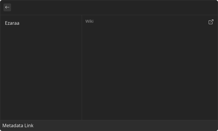
List.Detail.Metadata.Link
Link with a title
Example
- src/metadata-link.tsx
- gauntlet.toml
import { ReactElement } from "react";
import { List } from "@project-gauntlet/api/components";

export default function MetadataLinkExample(): ReactElement {
    return (
        <List>
            <List.Item id="ezaraa" title="Ezaraa"/>
            <List.Detail>
                <List.Detail.Metadata>
                    <List.Detail.Metadata.Link label="Wiki" href="https://starwars.fandom.com/wiki/Ezaraa"/>
                </List.Detail.Metadata>
            </List.Detail>
        </List>
    )
}
Props
| Name | Is Required | Type | Description |
|---|---|---|---|
| label | Required | string | Name of the value |
| href | Required | string | Clickable link |
Children components (order-sensitive)
Available order-sensitive React children components. The order in which these elements are be placed in code will be reflected in UI
| Name | React Component Type | Amount |
|---|---|---|
| string | Zero or More |
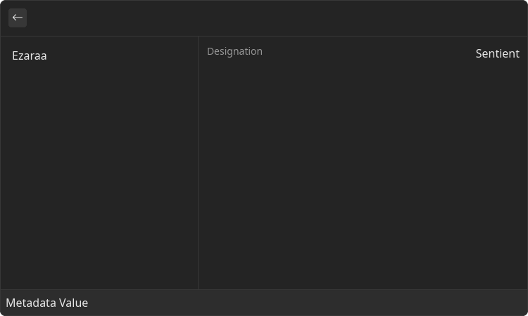
List.Detail.Metadata.Value
Simple string value with a title
Example
- src/metadata-value.tsx
- gauntlet.toml
import { ReactElement } from "react";
import { List } from "@project-gauntlet/api/components";

export default function MetadataValueExample(): ReactElement {
    return (
        <List>
            <List.Item id="ezaraa" title="Ezaraa"/>
            <List.Detail>
                <List.Detail.Metadata>
                    <List.Detail.Metadata.Value label="Designation">Sentient</List.Detail.Metadata.Value>
                </List.Detail.Metadata>
            </List.Detail>
        </List>
    )
}
Props
| Name | Is Required | Type | Description |
|---|---|---|---|
| label | Required | string | Name of the value |
Children components (order-sensitive)
Available order-sensitive React children components. The order in which these elements are be placed in code will be reflected in UI
| Name | React Component Type | Amount |
|---|---|---|
| string | Zero or More |
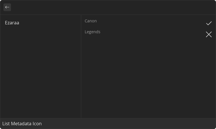
List.Detail.Metadata.Icon
Icon value with a title
Example
- src/metadata-icon.tsx
- gauntlet.toml
import { ReactElement } from "react";
import { Icons, List } from "@project-gauntlet/api/components";

export default function MetadataIconExample(): ReactElement {
    return (
        <List>
            <List.Item id="ezaraa" title="Ezaraa"/>
            <List.Detail>
                <List.Detail.Metadata>
                    <List.Detail.Metadata.Icon label="Canon" icon={Icons.Checkmark}/>
                    <List.Detail.Metadata.Icon label="Legends" icon={Icons.XMark}/>
                </List.Detail.Metadata>
            </List.Detail>
        </List>
    )
}
Props
| Name | Is Required | Type | Description |
|---|---|---|---|
| icon | Required | Icons | Icon displayed under the label |
| label | Required | string | Name of the value |
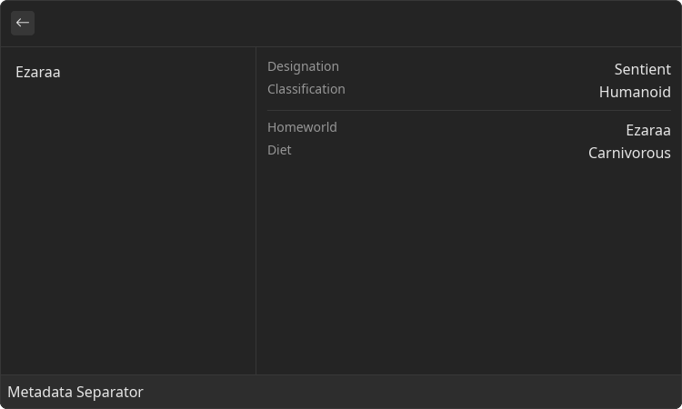
List.Detail.Metadata.Separator
Horizontal separator that allows to visually divide list of values
Example
- src/metadata-separator.tsx
- gauntlet.toml
import { ReactElement } from "react";
import { List } from "@project-gauntlet/api/components";

export default function MetadataSeparatorExample(): ReactElement {
    return (
        <List>
            <List.Item id="ezaraa" title="Ezaraa"/>
            <List.Detail>
                <List.Detail.Metadata>
                    <List.Detail.Metadata.Value label="Designation">Sentient</List.Detail.Metadata.Value>
                    <List.Detail.Metadata.Value label="Classification">Humanoid</List.Detail.Metadata.Value>
                    <List.Detail.Metadata.Separator/>
                    <List.Detail.Metadata.Value label="Homeworld">Ezaraa</List.Detail.Metadata.Value>
                    <List.Detail.Metadata.Value label="Diet">Carnivorous</List.Detail.Metadata.Value>
                </List.Detail.Metadata>
            </List.Detail>
        </List>
    )
}
List.Detail.Content
Content is a container for a set of non-interactable components. Used in a variety of places like <Detail/>, <Inline/> and <GridItem/>. By utilizing the power of React the content can also be made dynamic
Example
- src/content.tsx
- gauntlet.toml
import { ReactElement } from "react";
import { Action, ActionPanel, List } from "@project-gauntlet/api/components";

export default function ContentExample(): ReactElement {
    return (
        <List
            actions={
                <ActionPanel>
                    <Action label="Select" onAction={() => {}}/>
                </ActionPanel>
            }
        >
            <List.Item id="adarian" title="Adarian"/>
            <List.Item id="aruzan" title="Aruzan"/>
            <List.Item id="blutopian" title="Blutopian"/>
            <List.Item id="caphex" title="Caphex"/>
            <List.Item id="condluran" title="Condluran"/>
            <List.Item id="frozian" title="Frozian"/>
            <List.Item id="evereni" title="Evereni"/>
            <List.Item id="ezaraa" title="Ezaraa"/>
            <List.Item id="houk" title="Houk"/>
            <List.Item id="inleshat" title="Inleshat"/>
            <List.Detail>
                <List.Detail.Content>
                    <List.Detail.Content.Paragraph>
                        The Ezaraa were a species of warmongering carnivorous sentients that were native to the the planet
                        Ezaraa.
                        They intended to overthrow the Galactic Empire, only to replace it with their own dominion and feed
                        on the other species, which they deemed as lesser to them.
                        To arm their revolution, the dominion sent Ezaraa to take advantage of opportunities such as the
                        Auction of Rur.
                    </List.Detail.Content.Paragraph>
                    <List.Detail.Content.H4>
                        Society and culture
                    </List.Detail.Content.H4>
                    <List.Detail.Content.CodeBlock>
                        "Bring the Dominion of the Ezaraa across the stars! And consume the flesh of all the lesser
                        species!"
                    </List.Detail.Content.CodeBlock>
                    <List.Detail.Content.Paragraph>
                        ―An Ezaraa, to Luke Skywalker
                    </List.Detail.Content.Paragraph>
                </List.Detail.Content>
            </List.Detail>
        </List>
    )
}
Children components (order-sensitive)
Available order-sensitive React children components. The order in which these elements are be placed in code will be reflected in UI
| Name | React Component Type | Amount |
|---|---|---|
| Paragraph | <Paragraph/> | Zero or More |
| Image | <Image/> | Zero or More |
| Svg | <Svg/> | Zero or More |
| H1 | <H1/> | Zero or More |
| H2 | <H2/> | Zero or More |
| H3 | <H3/> | Zero or More |
| H4 | <H4/> | Zero or More |
| H5 | <H5/> | Zero or More |
| H6 | <H6/> | Zero or More |
| HorizontalBreak | <HorizontalBreak/> | Zero or More |
| CodeBlock | <CodeBlock/> | Zero or More |
List.Detail.Content.Paragraph
Text paragraph
Example
- src/content-paragraph.tsx
- gauntlet.toml
import { ReactElement } from "react";
import { List } from "@project-gauntlet/api/components";
export default function ContentParagraphExample(): ReactElement {
return (
<List>
<List.Item id="adarian" title="Adarian"/>
<List.Item id="aruzan" title="Aruzan"/>
<List.Item id="blutopian" title="Blutopian"/>
<List.Item id="caphex" title="Caphex"/>
<List.Item id="condluran" title="Condluran"/>
<List.Item id="frozian" title="Frozian"/>
<List.Item id="evereni" title="Evereni"/>
<List.Item id="ezaraa" title="Ezaraa"/>
<List.Item id="houk" title="Houk"/>
<List.Item id="inleshat" title="Inleshat"/>
<List.Detail>
<List.Detail.Content>
<List.Detail.Content.Paragraph>
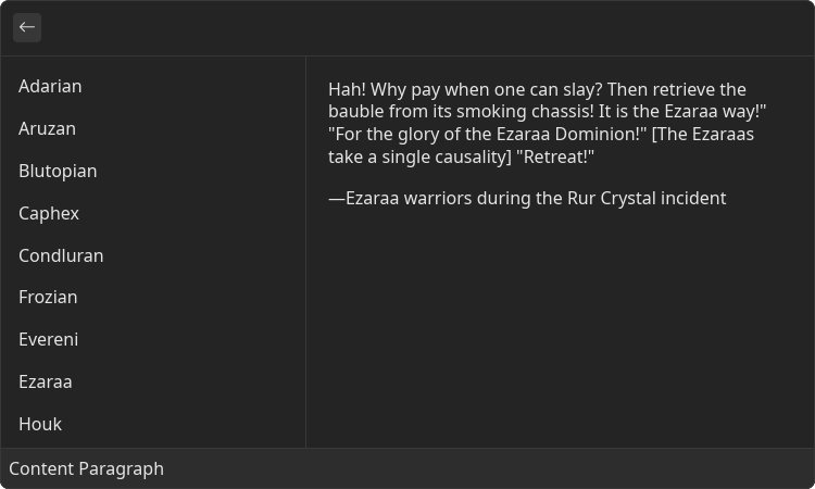
Hah! Why pay when one can slay? Then retrieve the bauble from its smoking chassis! It is the Ezaraa way!"
"For the glory of the Ezaraa Dominion!"
[The Ezaraas take a single causality]
"Retreat!"
</List.Detail.Content.Paragraph>
<List.Detail.Content.Paragraph>
―Ezaraa warriors during the Rur Crystal incident
</List.Detail.Content.Paragraph>
</List.Detail.Content>
</List.Detail>
</List>
)
}
Children components (order-sensitive)
Available order-sensitive React children components. The order in which these elements are be placed in code will be reflected in UI
| Name | React Component Type | Amount |
|---|---|---|
| string | Zero or More |
List.Detail.Content.Image
Component that displays arbitrary image
Example
- src/content-image.tsx
- gauntlet.toml
import { ReactElement } from "react";
import { List } from "@project-gauntlet/api/components";
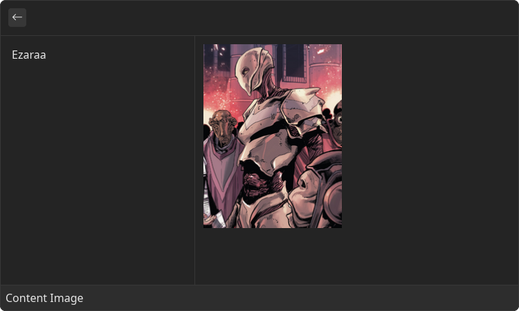
const imgUrl = "https://static.wikia.nocookie.net/starwars/images/9/9f/Ezaraa-TheScreamingCitadel1.png/revision/latest/scale-to-width-down/200?cb=20170511082800"
export default function ContentImageExample(): ReactElement {
return (
<List>
<List.Item id="ezaraa" title="Ezaraa"/>
<List.Detail>
<List.Detail.Content>
<List.Detail.Content.Image source={{ url: imgUrl }}/>
</List.Detail.Content>
</List.Detail>
</List>
)
}
Props
| Name | Is Required | Type | Description |
|---|---|---|---|
| source | Required | ImageLike | Image data. Supported formats: "png", "gif', "jpg", "webp", "tiff" |
List.Detail.Content.Svg
Component that displays arbitrary SVG image
Example
- src/content-svg.tsx
- gauntlet.toml
import { ReactElement } from "react";
import { List } from "@project-gauntlet/api/components";

const svgUrl = "https://upload.wikimedia.org/wikipedia/commons/8/84/Example.svg"

export default function ContentSvgExample(): ReactElement {
    return (
        <List>
            <List.Item id="svg" title="Svg Example"/>
            <List.Detail>
                <List.Detail.Content>
                    <List.Detail.Content.Svg source={{ url: svgUrl }}/>
                </List.Detail.Content>
            </List.Detail>
        </List>
    )
}
Props
| Name | Is Required | Type | Description |
|---|---|---|---|
| source | Required | DataSource | SVG image |
List.Detail.Content.H1-6
Headers
Example
- src/content-headers.tsx
- gauntlet.toml
import { ReactElement } from "react";
import { List } from "@project-gauntlet/api/components";
export default function ContentHeadersExample(): ReactElement {
return (
<List>
<List.Item id="adarian" title="Adarian"/>
<List.Item id="aruzan" title="Aruzan"/>
<List.Item id="blutopian" title="Blutopian"/>
<List.Item id="caphex" title="Caphex"/>
<List.Item id="condluran" title="Condluran"/>
<List.Item id="frozian" title="Frozian"/>
<List.Item id="evereni" title="Evereni"/>
<List.Item id="ezaraa" title="Ezaraa"/>
<List.Item id="houk" title="Houk"/>
<List.Item id="inleshat" title="Inleshat"/>
<List.Detail>
<List.Detail.Content>
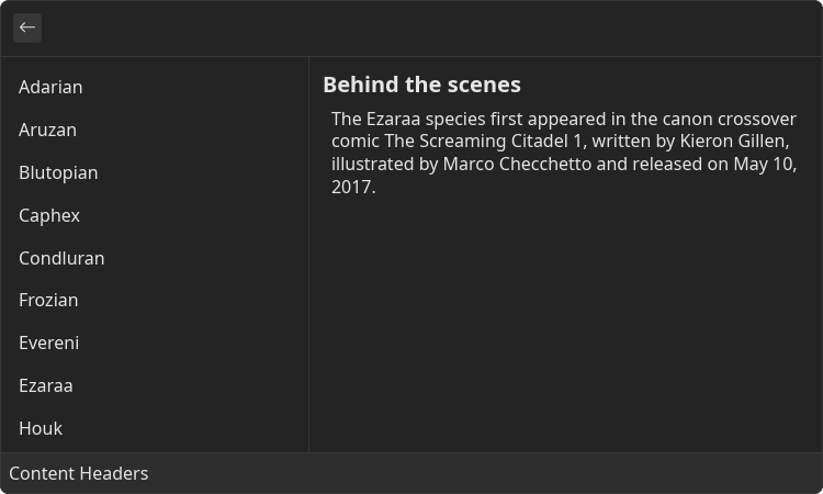
<List.Detail.Content.H4>
Behind the scenes
</List.Detail.Content.H4>
<List.Detail.Content.Paragraph>
The Ezaraa species first appeared in the canon crossover comic The Screaming Citadel 1, written by Kieron Gillen, illustrated by Marco Checchetto and released on May 10, 2017.
</List.Detail.Content.Paragraph>
</List.Detail.Content>
</List.Detail>
</List>
)
}
Children components (order-sensitive)
Available order-sensitive React children components. The order in which these elements are be placed in code will be reflected in UI
| Name | React Component Type | Amount |
|---|---|---|
| string | Zero or More |
List.Detail.Content.HorizontalBreak
Horizontal line that divides the content
Example
- src/content-horizontal-break.tsx
- gauntlet.toml
import { ReactElement } from "react";
import { List } from "@project-gauntlet/api/components";
export default function ContentHorizontalBreakExample(): ReactElement {
return (
<List>
<List.Item id="adarian" title="Adarian"/>
<List.Item id="aruzan" title="Aruzan"/>
<List.Item id="blutopian" title="Blutopian"/>
<List.Item id="caphex" title="Caphex"/>
<List.Item id="condluran" title="Condluran"/>
<List.Item id="frozian" title="Frozian"/>
<List.Item id="evereni" title="Evereni"/>
<List.Item id="ezaraa" title="Ezaraa"/>
<List.Item id="houk" title="Houk"/>
<List.Item id="inleshat" title="Inleshat"/>
<List.Detail>
<List.Detail.Content>
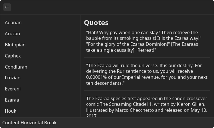
<List.Detail.Content.H3>
Quotes
</List.Detail.Content.H3>
<List.Detail.Content.Paragraph>
"Hah! Why pay when one can slay? Then retrieve the bauble from its smoking chassis! It is the Ezaraa way!"
"For the glory of the Ezaraa Dominion!"
[The Ezaraas take a single causality]
"Retreat!"
</List.Detail.Content.Paragraph>
<List.Detail.Content.HorizontalBreak/>
<List.Detail.Content.Paragraph>
"The Ezaraa will rule the universe. It is our destiny. For delivering the Rur sentience to us, you will receive 0.00001% of our Imperial revenue, for you and your next ten descendants."
</List.Detail.Content.Paragraph>
<List.Detail.Content.HorizontalBreak/>
<List.Detail.Content.Paragraph>
The Ezaraa species first appeared in the canon crossover comic The Screaming Citadel 1, written by Kieron Gillen, illustrated by Marco Checchetto and released on May 10, 2017.
</List.Detail.Content.Paragraph>
</List.Detail.Content>
</List.Detail>
</List>
)
}
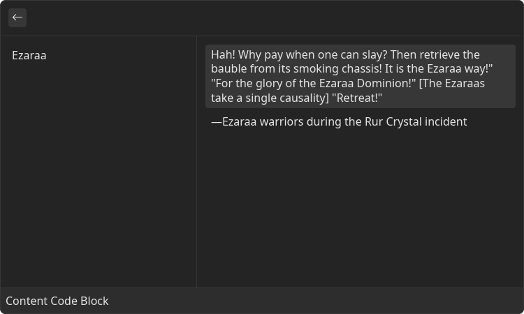
List.Detail.Content.CodeBlock
Block of text that is represented as a code
Example
- src/content-code-block.tsx
- gauntlet.toml
import { ReactElement } from "react";
import { List } from "@project-gauntlet/api/components";

export default function ContentCodeBlockExample(): ReactElement {
    return (
        <List>
            <List.Item id="ezaraa" title="Ezaraa"/>
            <List.Detail>
                <List.Detail.Content>
                    <List.Detail.Content.CodeBlock>
                        Hah! Why pay when one can slay? Then retrieve the bauble from its smoking chassis! It is the Ezaraa way!"
                        "For the glory of the Ezaraa Dominion!"
                        [The Ezaraas take a single causality]
                        "Retreat!"
                    </List.Detail.Content.CodeBlock>
                    <List.Detail.Content.Paragraph>
                        ―Ezaraa warriors during the Rur Crystal incident
                    </List.Detail.Content.Paragraph>
                </List.Detail.Content>
            </List.Detail>
        </List>
    )
}
Children components (order-sensitive)
Available order-sensitive React children components. The order in which these elements are be placed in code will be reflected in UI
| Name | React Component Type | Amount |
|---|---|---|
| string | Zero or More |