Form
Overview
Form is a view which provides a way to collect different types information
Plugin Manifest
To use this view, entrypoint with type "view" is required
Example
[[entrypoint]]
id = 'main'
name = 'Main'
path = 'src/main.tsx'
type = 'view'
description = 'Description of a Form view'
API Reference
Form
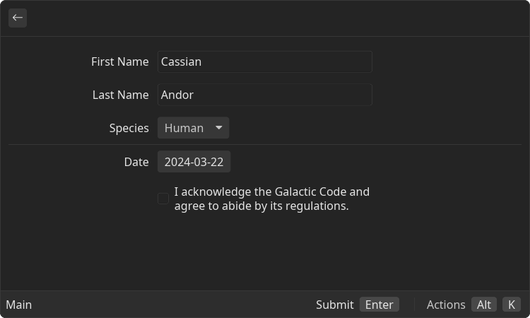
Form is a root component that contains a set of input field of various types. Use it to allow users to provide data
Example
- src/main.tsx
- gauntlet.toml
import { ReactElement } from 'react';
import { Action, ActionPanel, Form } from "@project-gauntlet/api/components";

export default function MainExample(): ReactElement {
    return (
        <Form
            actions={
                <ActionPanel>
                    <Action label="Submit" onAction={() => {}}/>
                </ActionPanel>
            }
        >
            <Form.TextField label="First Name" value="Cassian" onChange={value => {
                console.log(`First Name: ${value}`)
            }}/>
            <Form.TextField label="Last Name" value="Andor" onChange={value => {
                console.log(`Last Name: ${value}`)
            }}/>
            <Form.Select
                label="Species"
                value="human"
                onChange={value => {
                console.log(`Last Name: ${value}`)
            }}>
                <Form.Select.Item value="human">Human</Form.Select.Item>
                <Form.Select.Item value="jawa">Jawa</Form.Select.Item>
                <Form.Select.Item value="hutt">Hutt</Form.Select.Item>
                <Form.Select.Item value="twi'lek">Twi'lek</Form.Select.Item>
            </Form.Select>

            <Form.Separator/>

            <Form.Checkbox
                title="I acknowledge the Galactic Code and agree to abide by its regulations."
                value={false}
                onChange={value => {
                    console.log(`terms of service: ${value}`)
                }}
            />
        </Form>
    );
};
Props
| Name | Is Required | Type | Description |
|---|---|---|---|
| isLoading | Optional | boolean | If "true" loading bar is shown above content |
| actions | Optional | <ActionPanel/> | Allows to define an Action Panel for this view. Every root component has such property |
Children components (order-sensitive)
Available order-sensitive React children components. The order in which these elements are be placed in code will be reflected in UI
| Name | React Component Type | Amount |
|---|---|---|
| TextField | <TextField/> | Zero or More |
| PasswordField | <PasswordField/> | Zero or More |
| Checkbox | <Checkbox/> | Zero or More |
| Select | <Select/> | Zero or More |
| Separator | <Separator/> | Zero or More |
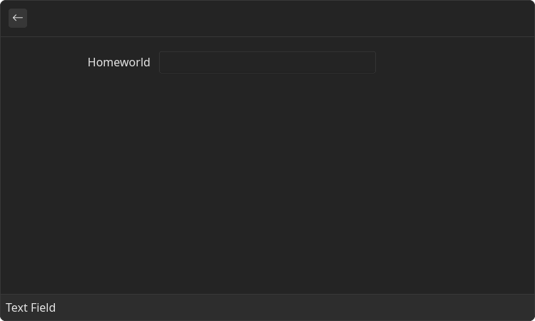
Form.TextField
Text field input
Example
- src/text-field.tsx
- gauntlet.toml
Props
| Name | Is Required | Type | Description |
|---|---|---|---|
| label | Optional | string | Text displayed in UI to the left of the input field itself |
| value | Optional | string | String value of the field. Can be used to implement controlled form |
| onChange | Optional | () => void | Function that is called when the value of the text value in field was changed |
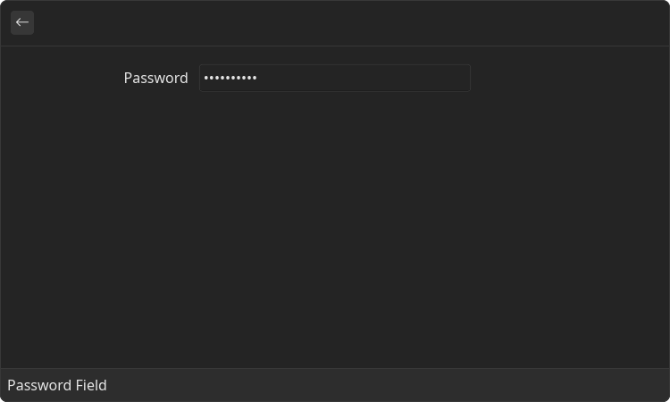
Form.PasswordField
Text field input with hidden value
Example
- src/password-field.tsx
- gauntlet.toml
Props
| Name | Is Required | Type | Description |
|---|---|---|---|
| label | Optional | string | Text displayed in UI to the left of the input field itself |
| value | Optional | string | String value of the field. Can be used to implement controlled form |
| onChange | Optional | () => void | Function that is called when the value of the text value in field was changed |
Form.Checkbox
Text field input
Example
- src/checkbox.tsx
- gauntlet.toml
import { ReactElement } from 'react';
import { Form } from "@project-gauntlet/api/components";

export default function CheckboxExample(): ReactElement {
    return (
        <Form>
            <Form.Checkbox
                label="Have heard about"
                title="The Tragedy of Darth Plagueis the Wise"
                value={true}
                onChange={value => {
                    console.log(`value: ${value}`)
                }}
            />
        </Form>
    );
};
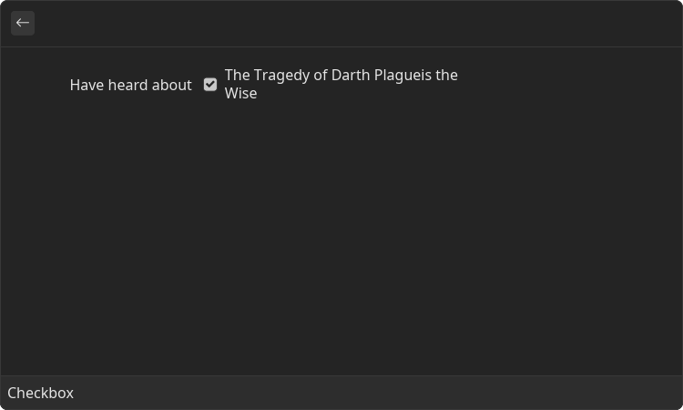
Props
| Name | Is Required | Type | Description |
|---|---|---|---|
| label | Optional | string | Text displayed in UI to the left of the input field itself |
| value | Optional | string | String value of the field. Can be used to implement controlled form |
| onChange | Optional | () => void | Function that is called when the value of the text value in field was changed |
Form.Select
Field that allows to select a single value in a predefined list
Example
- src/select.tsx
- gauntlet.toml
import { ReactElement } from 'react';
import { Form } from "@project-gauntlet/api/components";

export default function SelectExample(): ReactElement {
    return (
        <Form>
            <Form.Select label="Species" value="human">
                <Form.Select.Item value="human">Human</Form.Select.Item>
                <Form.Select.Item value="jawa">Jawa</Form.Select.Item>
                <Form.Select.Item value="hutt">Hutt</Form.Select.Item>
                <Form.Select.Item value="twi'lek">Twi'lek</Form.Select.Item>
                <Form.Select.Item value="wookie">Wookie</Form.Select.Item>
                <Form.Select.Item value="kaminoan">Kaminoan</Form.Select.Item>
            </Form.Select>
        </Form>
    );
};
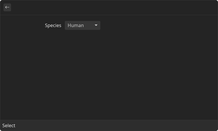
Props
| Name | Is Required | Type | Description |
|---|---|---|---|
| label | Optional | string | Text displayed in UI to the left of the input itself |
| value | Optional | string | String value of the field. Can be used to implement controlled form |
| onChange | Optional | () => void | Function that is called when the selected item was changed |
Children components (order-sensitive)
Available order-sensitive React children components. The order in which these elements are be placed in code will be reflected in UI
| Name | React Component Type | Amount |
|---|---|---|
| Item | <SelectItem/> | Zero or More |
Form.Select.Item
Predefined item that can be selected from the select form input list
Props
| Name | Is Required | Type | Description |
|---|---|---|---|
| value | Required | string | Internal value of the selected item |
Children components (order-sensitive)
Available order-sensitive React children components. The order in which these elements are be placed in code will be reflected in UI
| Name | React Component Type | Amount |
|---|---|---|
| string | Zero or More |
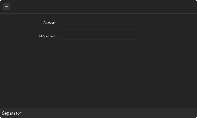
Form.Separator
Horizontal line to visually separate list of field