Detail
Overview
Detail is a view which can display everything that could go into an article: text, images, code block etc. It can appear as a standalone view or as a part of List view on the right-hand side
Functionality
- Can have some structured data on the right-hand side
- As with all other views can be made highly dynamic with help of React
Plugin Manifest
To use this view, entrypoint with type "view" is required
Example
[[entrypoint]]
id = 'main'
name = 'Main'
path = 'src/main.tsx'
type = 'view'
description = 'Description of a Detail view'
API Reference
Detail
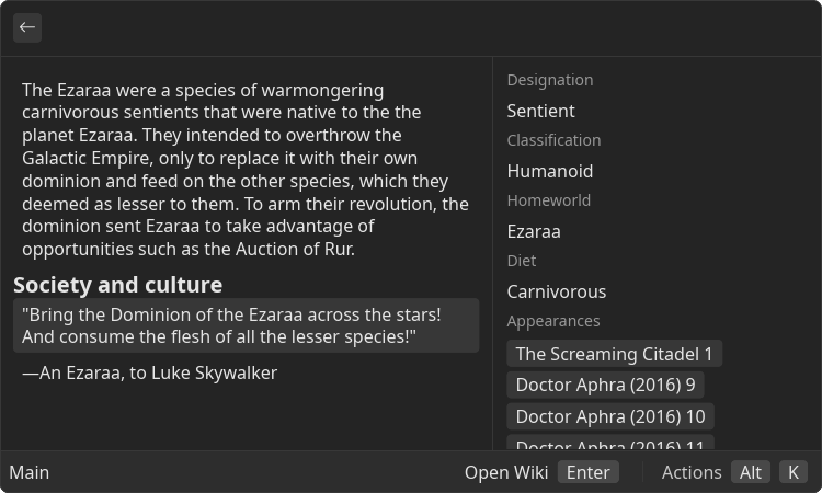
Detail is a root component that contains a possibly dynamic, non-interactable <Content/> component and an optional side panel
Example
- src/main.tsx
- gauntlet.toml
import { ReactNode } from "react";
import { Action, ActionPanel, Detail } from "@project-gauntlet/api/components";
export default function Main(): ReactNode {
return (
<Detail
actions={
<ActionPanel>
<Action label="Open Wiki" onAction={() => {/* */}}/>
</ActionPanel>
}
>
<Detail.Metadata>
<Detail.Metadata.Value label={"Designation"}>Sentient</Detail.Metadata.Value>
<Detail.Metadata.Value label={"Classification"}>Humanoid</Detail.Metadata.Value>
<Detail.Metadata.Value label={"Homeworld"}>Ezaraa</Detail.Metadata.Value>
<Detail.Metadata.Value label={"Diet"}>Carnivorous</Detail.Metadata.Value>
<Detail.Metadata.TagList label={"Appearances"}>
<Detail.Metadata.TagList.Item>The Screaming Citadel 1</Detail.Metadata.TagList.Item>
<Detail.Metadata.TagList.Item>Doctor Aphra (2016) 9</Detail.Metadata.TagList.Item>
<Detail.Metadata.TagList.Item>Doctor Aphra (2016) 10</Detail.Metadata.TagList.Item>
<Detail.Metadata.TagList.Item>Doctor Aphra (2016) 11</Detail.Metadata.TagList.Item>
<Detail.Metadata.TagList.Item>Doctor Aphra (2016) 12</Detail.Metadata.TagList.Item>
</Detail.Metadata.TagList>
</Detail.Metadata>
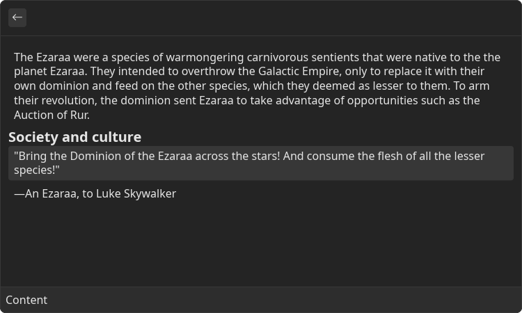
<Detail.Content>
<Detail.Content.Paragraph>
The Ezaraa were a species of warmongering carnivorous sentients that were native to the the planet Ezaraa.
They intended to overthrow the Galactic Empire, only to replace it with their own dominion and feed on the other species, which they deemed as lesser to them.
To arm their revolution, the dominion sent Ezaraa to take advantage of opportunities such as the Auction of Rur.
</Detail.Content.Paragraph>
<Detail.Content.H4>
Society and culture
</Detail.Content.H4>
<Detail.Content.CodeBlock>
"Bring the Dominion of the Ezaraa across the stars! And consume the flesh of all the lesser species!"
</Detail.Content.CodeBlock>
<Detail.Content.Paragraph>
―An Ezaraa, to Luke Skywalker
</Detail.Content.Paragraph>
</Detail.Content>
</Detail>
)
}
Props
| Name | Is Required | Type | Description |
|---|---|---|---|
| isLoading | Optional | boolean | If "true" loading bar is shown above content |
| actions | Optional | <ActionPanel/> | Allows to define an Action Panel for this view. Every root component has such property |
Children components (non-order-sensitive)
Available non-order-sensitive React children components. The position in children doesn't matter for these elements
| Name | React Component Type | Amount |
|---|---|---|
| Metadata | <Metadata/> | Zero or One |
| Content | <Content/> | Zero or One |
Detail.Metadata
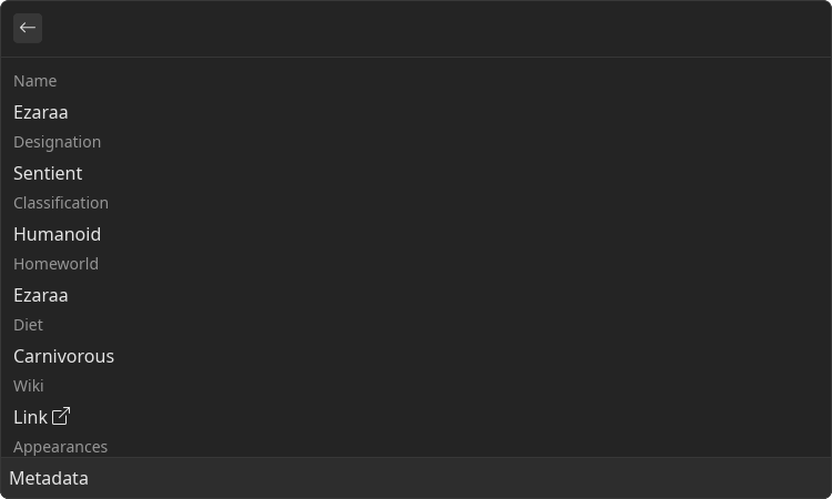
Metadata is a component that displays list of name-value pairs. Can contain interactive parts
Example
- src/metadata.tsx
- gauntlet.toml
import { ReactNode } from "react";
import { Detail } from "@project-gauntlet/api/components";

export default function Metadata(): ReactNode {
    return (
        <Detail>
            <Detail.Metadata>
                <Detail.Metadata.Value label={"Name"}>Ezaraa</Detail.Metadata.Value>
                <Detail.Metadata.Value label={"Designation"}>Sentient</Detail.Metadata.Value>
                <Detail.Metadata.Value label={"Classification"}>Humanoid</Detail.Metadata.Value>
                <Detail.Metadata.Value label={"Homeworld"}>Ezaraa</Detail.Metadata.Value>
                <Detail.Metadata.Value label={"Diet"}>Carnivorous</Detail.Metadata.Value>
                <Detail.Metadata.Link label={"Wiki"} href="https://starwars.fandom.com/wiki/Ezaraa">Link</Detail.Metadata.Link>
                <Detail.Metadata.TagList label={"Appearances"}>
                    <Detail.Metadata.TagList.Item>The Screaming Citadel 1</Detail.Metadata.TagList.Item>
                    <Detail.Metadata.TagList.Item>Doctor Aphra (2016) 9</Detail.Metadata.TagList.Item>
                    <Detail.Metadata.TagList.Item>Doctor Aphra (2016) 10</Detail.Metadata.TagList.Item>
                    <Detail.Metadata.TagList.Item>Doctor Aphra (2016) 11</Detail.Metadata.TagList.Item>
                    <Detail.Metadata.TagList.Item>Doctor Aphra (2016) 12</Detail.Metadata.TagList.Item>
                </Detail.Metadata.TagList>
            </Detail.Metadata>
        </Detail>
    )
}
Children components (order-sensitive)
Available order-sensitive React children components. The order in which these elements are be placed in code will be reflected in UI
| Name | React Component Type | Amount |
|---|---|---|
| TagList | <MetadataTagList/> | Zero or More |
| Link | <MetadataLink/> | Zero or More |
| Value | <MetadataValue/> | Zero or More |
| Icon | <MetadataIcon/> | Zero or More |
| Separator | <MetadataSeparator/> | Zero or More |
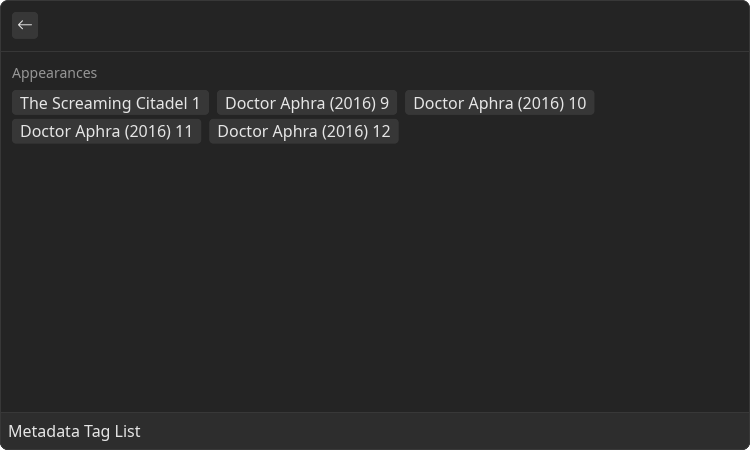
Detail.Metadata.TagList
List of tags with a title Tags can be used as clickable button
Example
- src/metadata-tag-list.tsx
- gauntlet.toml
import { ReactNode } from "react";
import { Detail } from "@project-gauntlet/api/components";
import { showHud } from "@project-gauntlet/api/helpers";

const items = [
    "The Screaming Citadel 1",
    "Doctor Aphra (2016) 9",
    "Doctor Aphra (2016) 10",
    "Doctor Aphra (2016) 11",
    "Doctor Aphra (2016) 12"
]

export default function MetadataTagList(): ReactNode {
    return (
        <Detail>
            <Detail.Metadata>
                <Detail.Metadata.TagList label={"Appearances"}>
                    {
                        items.map(value => {
                            return (
                                <Detail.Metadata.TagList.Item onClick={() => showHud(value)}>
                                    {value}
                                </Detail.Metadata.TagList.Item>
                            )
                        })
                    }
                </Detail.Metadata.TagList>
            </Detail.Metadata>
        </Detail>
    )
}
Props
| Name | Is Required | Type | Description |
|---|---|---|---|
| label | Required | string | Name of the value |
Children components (order-sensitive)
Available order-sensitive React children components. The order in which these elements are be placed in code will be reflected in UI
| Name | React Component Type | Amount |
|---|---|---|
| Item | <MetadataTagItem/> | Zero or More |
Detail.Metadata.TagList.Item
Tag item
Props
| Name | Is Required | Type | Description |
|---|---|---|---|
| onClick | Optional | () => void | Function that will be executed when user clicks on the tag |
Children components (order-sensitive)
Available order-sensitive React children components. The order in which these elements are be placed in code will be reflected in UI
| Name | React Component Type | Amount |
|---|---|---|
| string | Zero or More |
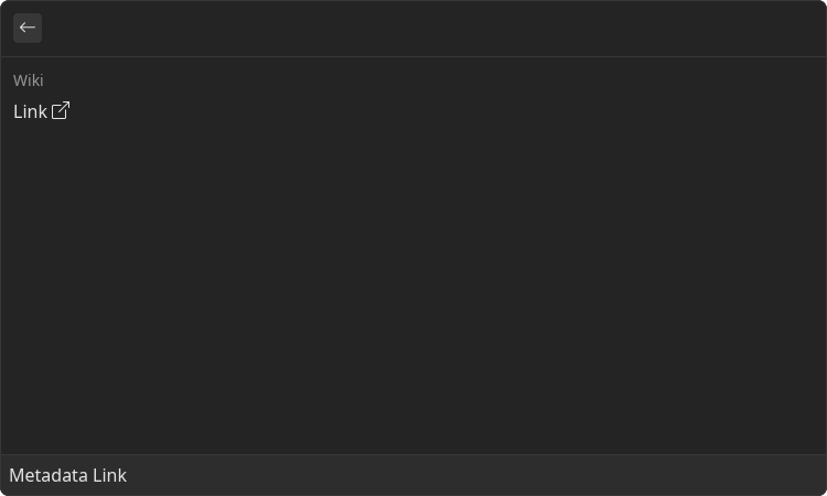
Detail.Metadata.Link
Link with a title
Example
- src/metadata-link.tsx
- gauntlet.toml
import { ReactNode } from "react";
import { Detail } from "@project-gauntlet/api/components";

export default function MetadataLink(): ReactNode {
    return (
        <Detail>
            <Detail.Metadata>
                <Detail.Metadata.Link label={"Wiki"} href="https://starwars.fandom.com/wiki/Ezaraa">Link</Detail.Metadata.Link>
            </Detail.Metadata>
        </Detail>
    )
}
Props
| Name | Is Required | Type | Description |
|---|---|---|---|
| label | Required | string | Name of the value |
| href | Required | string | Clickable link |
Children components (order-sensitive)
Available order-sensitive React children components. The order in which these elements are be placed in code will be reflected in UI
| Name | React Component Type | Amount |
|---|---|---|
| string | Zero or More |
Detail.Metadata.Value
Simple string value with a title
Example
- src/metadata-value.tsx
- gauntlet.toml
Props
| Name | Is Required | Type | Description |
|---|---|---|---|
| label | Required | string | Name of the value |
Children components (order-sensitive)
Available order-sensitive React children components. The order in which these elements are be placed in code will be reflected in UI
| Name | React Component Type | Amount |
|---|---|---|
| string | Zero or More |
Detail.Metadata.Icon
Icon value with a title
Example
- src/metadata-icon.tsx
- gauntlet.toml
Props
| Name | Is Required | Type | Description |
|---|---|---|---|
| icon | Required | Icons | Icon displayed under the label |
| label | Required | string | Name of the value |
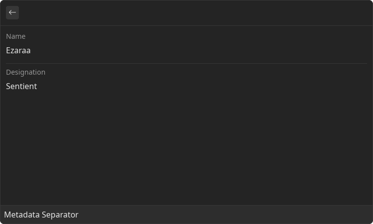
Detail.Metadata.Separator
Horizontal separator that allows to visually divide list of values
Example
- src/metadata-separator.tsx
- gauntlet.toml
import { ReactNode } from "react";
import { Detail } from "@project-gauntlet/api/components";

export default function MetadataSeparator(): ReactNode {
    return (
        <Detail>
            <Detail.Metadata>
                <Detail.Metadata.Value label={"Name"}>Ezaraa</Detail.Metadata.Value>
                <Detail.Metadata.Separator/>
                <Detail.Metadata.Value label={"Designation"}>Sentient</Detail.Metadata.Value>
            </Detail.Metadata>
        </Detail>
    )
}
Detail.Content
Content is a container for a set of non-interactable components. Used in a variety of places like <Detail/>, <Inline/> and <GridItem/>. By utilizing the power of React the content can also be made dynamic
Example
- src/content.tsx
- gauntlet.toml
import { ReactNode } from "react";
import { Detail } from "@project-gauntlet/api/components";

export default function Content(): ReactNode {
    return (
        <Detail>
            <Detail.Content>
                <Detail.Content.Paragraph>
                    The Ezaraa were a species of warmongering carnivorous sentients that were native to the the planet Ezaraa.
                    They intended to overthrow the Galactic Empire, only to replace it with their own dominion and feed on the other species, which they deemed as lesser to them.
                    To arm their revolution, the dominion sent Ezaraa to take advantage of opportunities such as the Auction of Rur.
                </Detail.Content.Paragraph>
                <Detail.Content.H4>
                    Society and culture
                </Detail.Content.H4>
                <Detail.Content.CodeBlock>
                    "Bring the Dominion of the Ezaraa across the stars! And consume the flesh of all the lesser species!"
                </Detail.Content.CodeBlock>
                <Detail.Content.Paragraph>
                    ―An Ezaraa, to Luke Skywalker
                </Detail.Content.Paragraph>
            </Detail.Content>
        </Detail>
    )
}
Children components (order-sensitive)
Available order-sensitive React children components. The order in which these elements are be placed in code will be reflected in UI
| Name | React Component Type | Amount |
|---|---|---|
| Paragraph | <Paragraph/> | Zero or More |
| Image | <Image/> | Zero or More |
| Svg | <Svg/> | Zero or More |
| H1 | <H1/> | Zero or More |
| H2 | <H2/> | Zero or More |
| H3 | <H3/> | Zero or More |
| H4 | <H4/> | Zero or More |
| H5 | <H5/> | Zero or More |
| H6 | <H6/> | Zero or More |
| HorizontalBreak | <HorizontalBreak/> | Zero or More |
| CodeBlock | <CodeBlock/> | Zero or More |
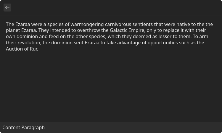
Detail.Content.Paragraph
Text paragraph
Example
- src/content-paragraph.tsx
- gauntlet.toml
import { ReactNode } from "react";
import { Detail } from "@project-gauntlet/api/components";

export default function ContentParagraph(): ReactNode {
    return (
        <Detail>
            <Detail.Content>
                <Detail.Content.Paragraph>
                    The Ezaraa were a species of warmongering carnivorous sentients that were native to the the planet Ezaraa.
                    They intended to overthrow the Galactic Empire, only to replace it with their own dominion and feed on the other species, which they deemed as lesser to them.
                    To arm their revolution, the dominion sent Ezaraa to take advantage of opportunities such as the Auction of Rur.
                </Detail.Content.Paragraph>
            </Detail.Content>
        </Detail>
    )
}
Children components (order-sensitive)
Available order-sensitive React children components. The order in which these elements are be placed in code will be reflected in UI
| Name | React Component Type | Amount |
|---|---|---|
| string | Zero or More |
Detail.Content.Image
Component that displays arbitrary image
Example
- src/content-image.tsx
- gauntlet.toml
import { ReactNode } from "react";
import { Detail } from "@project-gauntlet/api/components";

const imgUrl = "https://static.wikia.nocookie.net/starwars/images/a/ae/The_Whills_Strike_Back.png/revision/latest/scale-to-width-down/250?cb=20201006180053"

export default function ContentImage(): ReactNode {
    return (
        <Detail>
            <Detail.Content>
                <Detail.Content.Image source={{ url: imgUrl }}/>
            </Detail.Content>
        </Detail>
    )
}
Props
| Name | Is Required | Type | Description |
|---|---|---|---|
| source | Required | ImageLike | Image data. Supported formats: "png", "gif', "jpg", "webp", "tiff" |
Detail.Content.Svg
Component that displays arbitrary SVG image
Example
- src/content-svg.tsx
- gauntlet.toml
import { ReactNode } from "react";
import { Detail } from "@project-gauntlet/api/components";

const svgUrl = "https://upload.wikimedia.org/wikipedia/commons/8/84/Example.svg"

export default function ContentSvg(): ReactNode {
    return (
        <Detail>
            <Detail.Content>
                <Detail.Content.Svg source={{ url: svgUrl }}/>
            </Detail.Content>
        </Detail>
    )
}
Props
| Name | Is Required | Type | Description |
|---|---|---|---|
| source | Required | DataSource | SVG image |
Detail.Content.H1-6
Headers
Example
- src/content-header.tsx
- gauntlet.toml
import { ReactNode } from "react";
import { Detail } from "@project-gauntlet/api/components";

export default function ContentHeader(): ReactNode {
    return (
        <Detail>
            <Detail.Content>
                <Detail.Content.H1>
                    Header H1
                </Detail.Content.H1>
                <Detail.Content.H2>
                    Header H2
                </Detail.Content.H2>
                <Detail.Content.H3>
                    Header H3
                </Detail.Content.H3>
                <Detail.Content.H4>
                    Header H4
                </Detail.Content.H4>
                <Detail.Content.H5>
                    Header H5
                </Detail.Content.H5>
                <Detail.Content.H6>
                    Header H6
                </Detail.Content.H6>
            </Detail.Content>
        </Detail>
    )
}
Children components (order-sensitive)
Available order-sensitive React children components. The order in which these elements are be placed in code will be reflected in UI
| Name | React Component Type | Amount |
|---|---|---|
| string | Zero or More |
Detail.Content.HorizontalBreak
Horizontal line that divides the content
Example
- src/content-horizontal-break.tsx
- gauntlet.toml
import { ReactNode } from "react";
import { Detail } from "@project-gauntlet/api/components";

export default function ContentHorizontalBreak(): ReactNode {
    return (
        <Detail>
            <Detail.Content>
                <Detail.Content.Paragraph>
                    Did you know…
                </Detail.Content.Paragraph>
                <Detail.Content.HorizontalBreak/>
                <Detail.Content.Paragraph>
                    …that the Vandrayk Scale was a measurement that related likelihood for an asteroid to house the exogorth species?
                </Detail.Content.Paragraph>
            </Detail.Content>
        </Detail>
    )
}
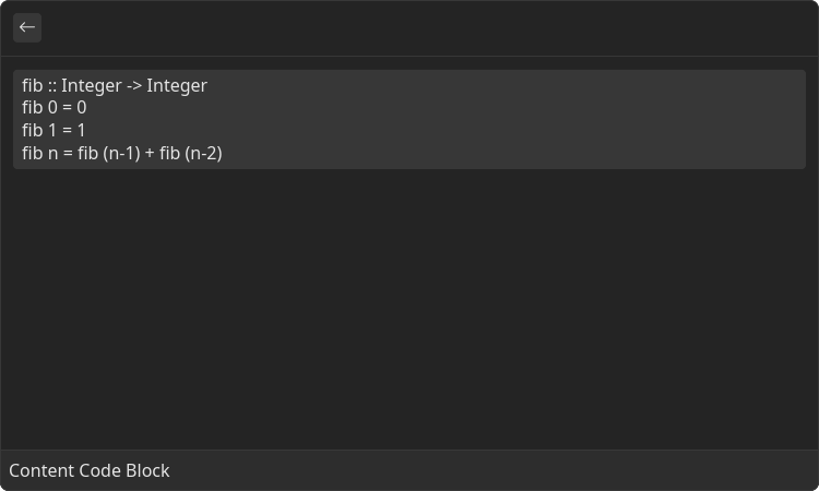
Detail.Content.CodeBlock
Block of text that is represented as a code
Example
- src/content-code-block.tsx
- gauntlet.toml
import { ReactNode } from "react";
import { Detail } from "@project-gauntlet/api/components";

const code = `\
fib :: Integer -> Integer
fib 0 = 0
fib 1 = 1
fib n = fib (n-1) + fib (n-2)
`

export default function ContentCodeBlock(): ReactNode {
    return (
        <Detail>
            <Detail.Content>
                <Detail.Content.CodeBlock>
                    {code}
                </Detail.Content.CodeBlock>
            </Detail.Content>
        </Detail>
    )
}
Children components (order-sensitive)
Available order-sensitive React children components. The order in which these elements are be placed in code will be reflected in UI
| Name | React Component Type | Amount |
|---|---|---|
| string | Zero or More |